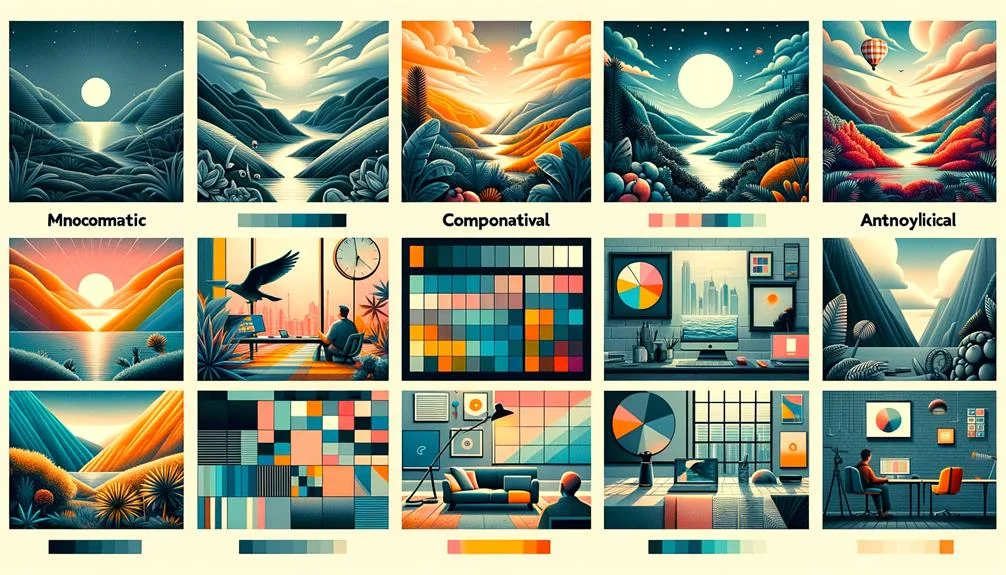
To choose stunning color combinations for your website, you need to understand color theory basics, such as the color wheel and primary colors. Create harmonious color combinations by selecting monochromatic, analogous, triadic, or compound schemes, and balance them for visual appeal. Consider the emotions and associations different colors evoke, and align them with your brand’s message and tone. Select colors that reflect your brand’s identity and amplify its message with primary and secondary colors. With the right tools and techniques, you’ll be able to craft a unique color strategy that engages your audience – and discover the secrets to making it truly unforgettable.
Understanding Color Theory Basics
By grasping the basics of color theory, you’ll be able to create effective color combinations that enhance your website’s design. Color theory is a multidisciplinary field that combines art and science to understand how colors interact and influence design.
At its core, the color wheel helps visualize relationships between colors, aiding in selecting harmonious combinations that elevate your brand identity. You’ll want to familiarize yourself with primary colors – red, yellow, and blue – as they form the foundation of all other colors.
When designing website color palettes, you’ll also consider the complementary color of your primary color choice, as this will help create visual interest and balance. A cohesive color palette considers not just the background color but the entire visual experience.
Color psychology also plays a pivotal role in shaping user experience. By thoughtfully applying color theory principles, you open up the potential for a stunning website that effectively communicates your message and engages your audience.
Understanding color theory basics is crucial to creating innovative, effective designs that set your brand apart in a crowded digital landscape. By applying these principles, you can develop a website that’s both visually striking and deeply engaging.
Creating Harmonious Color Combinations

As you start creating harmonious color combinations for your website, you’ll want to recall the color theory fundamentals and apply color harmony principles to create a visually appealing design.
You’ll consider visual balance techniques that guarantee your color choices work together effectively, taking into account factors like contrast, saturation, and brightness.
Color Theory Fundamentals
When it comes to creating harmonious color combinations for your website, understanding the fundamentals of color theory is essential for making informed design decisions. Color theory combines art and science to create visually appealing and cohesive color schemes. With the color wheel, you can visualize relationships between colors and select complementary combinations that elevate your design.
| Color Scheme | Description | Example |
|---|---|---|
| Monochromatic | Different shades of a single color | Various blues for a calming effect |
| Analogous | Colors next to each other on the color wheel | Blues, greens, and yellows for a natural look |
| Triadic | Colors equally spaced from each other on the color wheel | Blues, yellows, and reds for a bold contrast |
| Compound | Combination of two or more color schemes | Monochromatic blues with analogous greens for a cohesive yet interesting palette |
Color Harmony Principles
With a solid grasp of color theory fundamentals, you’re ready to apply color harmony principles to create visually appealing and balanced color combinations that elevate your website design.
By understanding how colors interact with each other, you can create harmonious color combinations that enhance the overall aesthetic appeal of your website.
Color harmony principles involve combining colors in a way that’s visually pleasing and balanced, taking into account color relationships, such as analogous, complementary, and triadic.
Visual Balance Techniques
Harmonious color combinations play an important role in achieving visual balance in website design. By mastering them, you can elevate your website’s aesthetic appeal and user experience. To create a visually appealing and balanced color palette, you need to explore the color wheel and color theory. By applying visual balance techniques, you can choose website color schemes that work in harmony, engaging your users and setting your brand apart.
You can achieve harmonious color combinations by using various techniques, such as monochromatic, analogous, and complementary schemes. Monochromatic color schemes use different shades of a single color, while analogous schemes feature colors that are adjacent on the color wheel. Complementary color schemes pair colors that are contrasting, creating a striking contrast. By experimenting with these techniques, you’ll find the perfect balance for your website’s color palette.
Best Color Palettes for Websites

Your website’s color palette plays an important role in shaping user experience and perception, so choosing the right combination is crucial. You want to select colors that not only reflect your brand but also create an emotional connection with your audience. A well-crafted design palette can elevate your website, making it more engaging, and memorable.
When it comes to creating beautiful color schemes for web design, there are many options to explore. Here are a few ideas to get you started:
- Consider using metallic color schemes like Shopify’s for a chic and 3D product display.
- Opt for vintage color schemes with earthy terracotta tones like Prometheus for a touch of futurism.
- Experiment with innovative color palettes like Refire’s deep teals and bright metallics for a dynamic look.
Using Color Psychology Effectively

Color psychology is a powerful tool that helps you create an emotional connection with your website visitors by leveraging the emotional associations of different colors. By understanding how colors can evoke emotions, you can select color combinations that elicit the desired emotional response from your audience.
For instance, if you want to draw attention to a specific call-to-action, using warm colors like red or orange can be effective. On the other hand, if you want to convey trust and stability, cool colors like blue or green may be a better choice.
When selecting colors for your website, consider the emotions you want to evoke and the desired message you want to convey. By choosing colors that align with your goals, you can create a visually engaging experience that resonates with your website visitors.
For example, combining blue and orange can create a sense of excitement and trust, while pairing yellow and green can evoke feelings of happiness and growth. By utilizing color psychology effectively, you can create a website that not only looks great but also connects with your audience on an emotional level, driving engagement and conversion.
Selecting Colors for Brand Identity

As you create your brand identity, you’re making a visual statement that communicates your values and personality to the world.
Your color choices play a huge role in shaping how people perceive your brand, so selecting colors that accurately reflect your brand’s tone, purpose, and messaging is crucial.
Key Color Selection Considerations
Choosing colors for brand identity requires a thoughtful approach that balances creativity with a deep understanding of the brand’s personality, values, and purpose. You want your website design to mirror your brand’s unique character, while also establishing a unified and visually appealing ambiance.
To achieve this, consider complementing your primary colors with secondary colors that amplify your brand’s message.
When picking colors, keep in mind the following key considerations:
- Limit your color palette to 3-5 core colors to uphold a sleek design aesthetic and avoid clutter.
- Select colors that resonate with your target audience and contribute to brand consistency and recognition.
- Experiment with harmonious colors to craft a distinctive and captivating visual identity.
Crafting Unique Brand Identity
To carve out a distinct online presence, you’ll need to develop a brand identity that’s deeply rooted in a thoughtful color strategy. This involves selecting colors that align with your brand’s personality, values, and purpose. By doing so, you’ll create a unique brand identity that resonates with your audience.
To establish a cohesive palette, complement your primary colors with secondary colors that enhance your brand’s message. Limit the number of colors used on your website to avoid clutter and maintain a consistent image.
A well-crafted color scheme contributes to brand recognition and consistency, making it essential to choose colors that will stand the test of time. Stay aware of color trends, but don’t be afraid to break away from the norm to create a truly unique brand identity.
Tools for Choosing Website Colors

What’s the best way to create a stunning color scheme for your website, considering the numerous options available?
You can utilize tools specifically designed to help you choose the perfect website colors. These tools make it easy to generate stunning color combinations that cater to your design needs.
For instance, you can use:
- Adobe Color, Coolors, and Paletton to generate harmonious color palettes
- HueSnap, Canva Color Palette Generator, and Khroma to select the perfect color schemes with advanced features
- Color Safe to guarantee accessibility by providing color combinations that meet contrast guidelines for text readability
These tools allow you to save hex codes from chosen color combinations, ensuring consistent use across different design elements on your website.
Balancing Color and Readability

When creating a color scheme for your website, striking a balance between aesthetics and legibility is crucial to make sure that your content is both visually appealing and easy to read. You want your website to evoke emotions and convey your brand’s personality, but not at the expense of readability.
To achieve this balance, focus on high contrast color combinations for your text and background. This ensures that your content is easily readable, even for users with visual impairments.
Don’t be afraid to experiment with different color combinations to find the right balance for your website. Color psychology plays a significant role in evoking emotions, so choose colors that align with your brand’s message. However, always prioritize readability.
Test your color combinations on various devices to make sure that they remain readable across different screens. By finding the perfect balance between aesthetics and legibility, you can create a website that’s both visually stunning and user-friendly.
To Recap
You’ve mastered the art of choosing stunning color combinations for your website!
With a solid grasp of color theory basics, harmony, and psychology, you’re now ready to create a visually stunning site that leaves visitors mesmerized.
Your color palette is so spot-on, it’s like a symphony of hues that makes users’ eyes do the happy dance.
Okay, maybe that’s a bit of an exaggeration, but trust us, your site is about to look a million times better.


