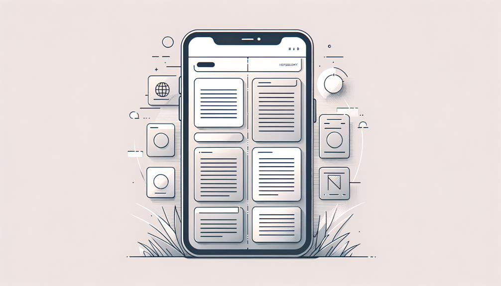
To succeed in mobile web design, you need to deliver an exceptional user experience that’s tailored to smaller screens and on-the-go interactions. Start by designing for thumb-friendly navigation, placing key elements in the lower half of the screen to reduce strain and frustration. Next, optimize for faster loading times by shrinking images and utilizing browser caching. Create readable and concise content with short paragraphs and clear headings. Prioritize responsive web design to reach a wider audience and boost search engine results. By simplifying layouts and focusing on essential elements, you’ll be well on your way to mobile web design success – and that’s just the beginning of crafting a winning strategy.
Design for Thumb-Friendly Navigation
How do you ensure your mobile website is easy to navigate, given that most users will be interacting with it almost exclusively using their thumbs?
The answer lies in thumb-friendly navigation, an essential aspect of mobile web design.
You see, users primarily interact with mobile devices using their thumbs, making thumb-friendly design vital for usability.
To achieve this, you’ll want to place key navigation elements and interactive buttons in the lower half of the screen. This simple yet effective tactic enhances the user experience on mobile, reducing strain and frustration.
Optimize for Faster Loading Times

To deliver a seamless mobile experience, you must prioritize site speed, as a mere one-second delay in page load time can lead to a 7% reduction in conversions. When it comes to optimizing for faster loading times, every second counts.
By focusing on speed optimization, you can improve load times, boost user engagement, and increase conversions.
Here are three key strategies to get you started:
- Shrink your images: Compressing images can reduce file sizes by up to 80%, drastically improving loading times on mobile devices.
- Leverage browser caching: Utilizing browser caching can lead to a 16% improvement in loading times, enhancing user experience on mobile.
- Load images on demand: Implementing lazy loading for images can decrease initial page load time by up to 50%, boosting mobile site performance.
Create Readable and Concise Content

With a site that loads quickly, you can focus on crafting content that’s just as effective at capturing and holding users’ attention, and that means creating readable and concise content that resonates on smaller mobile screens.
You want to make certain your mobile website design presents content in a way that’s easy to consume on-the-go. To achieve this, use short paragraphs and bullet points to break up the text, making it easier for users to scan and understand.
Prioritize the most important information for mobile users, who are more likely to be in a hurry. Use clear headings and subheadings to guide them through your content. Also, optimize text size and spacing for easy reading on smaller screens.
Prioritize Responsive Web Design

A mobile web design that prioritizes responsiveness is crucial, as it secures your site’s layout adapts seamlessly to different devices, providing an ideal user experience that drives engagement and conversions. You can’t afford to neglect the over 50% of internet traffic coming from mobile users. By implementing responsive web design, you’re future-proofing your website and improving your SEO rankings.
Here are three compelling reasons to prioritize responsive web design:
- Reach a wider audience: With responsive design, you can cater to users on various devices, from smartphones to tablets and desktops, securing a seamless browsing experience.
- Boost search engine results: Google favors mobile-friendly websites, so by prioritizing responsive design, you can enhance your website’s visibility in search engine results.
- Enhance user experience: By adapting to different screen sizes, you can secure that your content is easily accessible and readable, leading to a better mobile user experience.
Simplify Layouts for Better Usability

Simplifying your mobile web design layout is essential for improving usability, as it enables users to quickly find the information they need while on-the-go.
By streamlining your layout, you’ll reduce clutter and focus on the essential elements that matter most to your users. This approach leads to clean and intuitive designs that make navigation and engagement a breeze.
In fact, studies show that users prefer mobile layouts that prioritize key information and actions for quick access.
To Recap
You’ve got the inside scoop on mobile web design success, but the real challenge has just begun.
As you put these tips into action, remember that the mobile web is a constantly evolving beast. Stay ahead of the curve by continuously testing, iterating, and refining your design.
The line between success and failure is thin – will you be the one to crack the code and create a mobile masterpiece that resonates with users?


