When designing a user interface, you can greatly enhance user experience by applying typography best practices. To start, establish a consistent typography system with defined sizes, spacing, and styles, and balance line height with font size for a visually appealing layout. Use different type sizes, weights, and colors to create a clear visual hierarchy, and select fonts that prioritize readability and visual appeal. By leveraging system fonts, optimizing typography for responsiveness, and balancing text and white space, you can enhance user engagement and retention. With these techniques, you’ll be well on your way to crafting a more effective and user-friendly interface.
Establishing Typography Size and Spacing
When designing a user interface, establishing a clear typography size and spacing system is essential, as it enables you to create a cohesive visual hierarchy that effectively communicates information to your users.
By utilizing a consistent typography system with defined sizes and spacing, you’ll achieve a cohesive design that’s both aesthetically pleasing and user-friendly. To create a clear hierarchy, use a mix of type sizes, weights, and colors to distinguish between different types of content. Don’t forget to implement text styles in your design tools, making it easy to scale and make global changes.
As you define your typography sizes and line heights, remember to optimize for responsive typography, ensuring your design looks great across various devices and screen sizes. You’re not just setting font sizes and line heights; you’re creating a system that helps users navigate your content with ease.
Enhancing Legibility With Line Height
Building on your typography size and spacing system, you can further improve readability by enhancing line height, a often-overlooked detail that greatly impacts the overall legibility of your text.
When you balance line height with font size, you create a visually appealing and easy-to-read text layout. This balance is essential, as it enhances the flow of text and makes your content more scannable.
You can achieve best legibility by following these guidelines:
- Set your line height to 1.5 to 2 times the font size to maintain adequate spacing between lines.
- Avoid insufficient line height that can cause text to appear crowded and challenging to read.
Creating Clear Visual Hierarchy
As you create your typography, you’ll want to establish a clear visual hierarchy to guide your users through your content with ease. By defining clear visual hierarchy levels, you’ll help your users focus on the most important information first, and then naturally flow through to the supporting details.
To achieve this, you’ll need to thoughtfully structure your typography using size, color, and other visual elements to create a clear and consistent visual flow.
Define Visual Hierarchy Levels
To effectively communicate your content, you must establish a clear visual hierarchy that guides the user’s attention through your design. This can be achieved using typography by defining clear hierarchy levels. By utilizing different type sizes, weights, and colors, you create a hierarchy of information that directs the user’s attention to important elements.
When defining visual hierarchy levels, keep the following tips in mind:
- Use larger, bolder text to prioritize important elements and draw the user’s attention
- Use smaller, lighter text for supporting details to create a clear distinction between primary and secondary information
Establish Clear Type Structure
By creating a clear type structure, you can effectively direct the user’s attention through your design and enhance the overall user experience with a well-organized visual hierarchy. To achieve this, you’ll want to establish a clear system of font sizes, font weights, and color contrast that guides users through your content.
For instance, using larger font sizes for headers and smaller font sizes for body text creates a clear visual hierarchy, making it easy for users to scan and understand your content.
In addition to font sizes, varying font weights can also help establish hierarchy. Use bold font weights for headings and regular font weights for body text to create a clear distinction between different levels of information.
Whitespace is also vital in creating a clear type structure, as it helps separate content and enhances the visual hierarchy of your typography. By considering the reading patterns of your users and placing high-priority information in prominent positions, you can create a clear and intuitive visual hierarchy that enhances the overall user experience.
Effective typography is key to creating a well-organized and intuitive design.
Use Size and Color
Creating a clear visual hierarchy in your typography relies heavily on strategic use of size and color to guide users’ attention and foster engagement. By utilizing larger font sizes for headings and important information, you create a clear visual hierarchy that grabs users’ attention. You’re also improving readability by experimenting with color contrast between text and background, making it easier for users to focus on key content.
Here are a few ways you can leverage size and color to boost your typography:
- Use bold and vibrant colors sparingly to highlight specific elements, like calls-to-action or promotions, to guide users through your content.
- Apply color psychology principles to evoke emotions and influence user behavior – for example, using calming colors for a wellness website or energetic colors for a sports website.
Best Practices for Font Selection
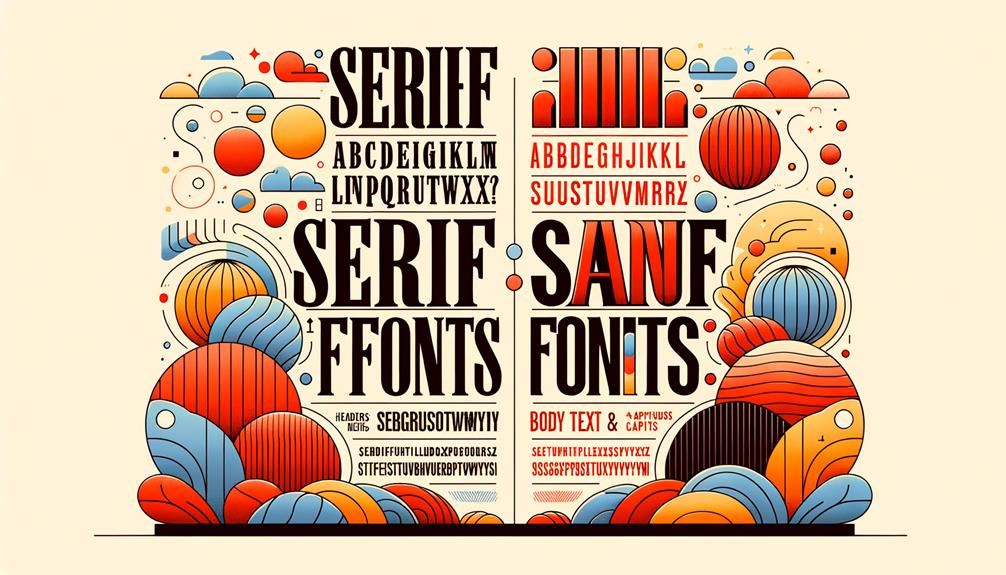
As you’re selecting fonts for your user experience design, you’re making a pivotal decision that impacts how your brand is perceived.
You want to choose fonts that not only reflect your brand’s personality but also cater to your target audience‘s preferences and needs.
Choosing System Fonts
When selecting fonts for your digital product, you’ll want to prioritize system fonts like San Francisco, Roboto, and Segoe, which are optimized for accessibility, faster loading times, and better design consistency across different devices. This choice will enhance the user experience and make your web design more effective.
System fonts are designed for legibility, reducing cognitive load for users, and they align with best practices for typography in web design.
Here are just a few reasons why system fonts should be your go-to choice:
Improved accessibility: System fonts are designed to be readable by everyone, including users with disabilities.
Faster loading times: Because system fonts are already installed on most devices, they load more quickly than custom fonts.
Better design consistency: System fonts are designed to work seamlessly across different devices and operating systems, ensuring a consistent look and feel for your digital product.
Limiting Font Weights
To maintain a clear visual hierarchy and design consistency in your digital product, limit your font weights to 2 or 3 variations. This helps create a structured aesthetic that guides users through your content.
By utilizing a few font weight variations, you establish a clear hierarchy in your design, making it easier for users to navigate and focus on the most significant elements.
Using excessive font weights can overwhelm your design elements, creating visual noise that distracts from the user experience. In contrast, a strategic and limited use of font weights creates a harmonious visual balance that enhances the overall design.
Consistency is key to a polished design aesthetic, and implementing a consistent font weight range is essential to achieving this goal.
Enhancing Readability Factors
Choosing the right font is crucial for readability, so you’ll want to select a typeface that strikes a balance between aesthetics and legibility to make sure your users can easily digest your content. When it comes to font selection, there are several factors to contemplate.
- Select fonts with purpose: Go for fonts that are designed with readability in mind, such as Arial, Roboto, or Open Sans, which have a clean and clear appearance.
- Font sizes matter: Choose font sizes between 16px to 18px for best legibility on screens, as this size range is neither too small nor too large.
A well-chosen font with a good x-height will also improve legibility, especially on digital screens.
Effective Use of Font Weights
By incorporating different font weights into your design, you can create a clear visual hierarchy that directs the user’s attention and effectively communicates the importance of various text elements. Font weights play an essential role in guiding users through your content, drawing attention to key information, and creating visual interest. A well-designed typographic system can make or break the user experience.
| Font Weight | Purpose | Effect |
|---|---|---|
| Light | Body text, secondary information | Enhances readability, creates contrast |
| Regular | Headings, primary information | Establishes hierarchy, conveys importance |
| Bold | Calls-to-action, emphasis | Draws attention, creates visual interest |
Leveraging System Fonts for Accessibility

As you establish a clear visual hierarchy with font weights, you can further enhance the user experience by leveraging system fonts, which are specifically designed to improve accessibility and readability across various devices.
By choosing system fonts like San Francisco, Roboto, and Segoe, you’ll not only improve loading times but also maintain design consistency across devices.
Here are just a few benefits of using system fonts:
Improved legibility: System fonts are designed for clarity and readability, benefiting users with varying needs.
Enhanced accessibility: Prioritizing system fonts aligns with best practices for improving user experience in web design.
Better usability: System fonts help create a seamless user experience, reducing the risk of users struggling to read or navigate your website.
Optimizing Typography for Responsiveness
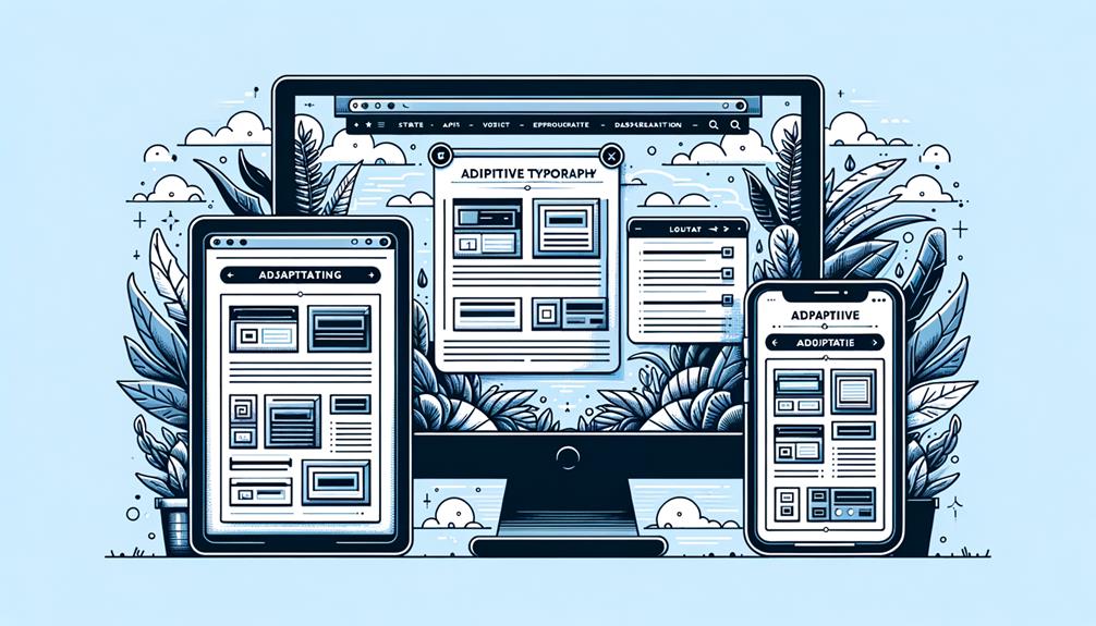
Your typography needs to adapt to the ever-changing screen sizes of various devices, which is where optimizing typography for responsiveness comes in. With responsive typography, you’ll adjust font sizes and spacing based on screen width to maintain readability. This guarantees that your text looks great on any device, from smartphones to desktop monitors.
To achieve this, you’ll use media queries to define specific typography styles for different screen sizes. For instance, on larger screens, you can increase font sizes to enhance legibility. Conversely, on mobile devices, you’ll want to optimize typography to prevent text overload and improve user experience. By making these adjustments, you’ll create a more comfortable reading experience for your users.
Consistency is key when it comes to responsive typography. By optimizing your typography across devices, you’ll enhance the overall user experience. Your users will appreciate the attention to detail, and your content will shine on any screen.
Balancing Text and White Space
Now that you’ve optimized your typography for responsiveness, it’s time to focus on another critical aspect of typography: achieving a harmonious balance between text and white space to elevate the visual appeal and readability of your design. Proper balance is key to preventing overcrowding and enhancing focus on content.
By strategically using white space, you create a sense of organization and clarity in typography.
Here are some key benefits of balancing text and white space:
- Enhanced readability: Adequate white space around text prevents visual overwhelm and improves comprehension.
- Improved visual appeal: A balanced design creates a harmonious and aesthetically pleasing user experience.
To Recap
You’ve now got a solid foundation in typography tips to enhance user experience. By implementing these strategies, you can notably enhance your website’s readability, accessibility, and overall user engagement.
Did you know that a study by Crazy Egg found that clear typography can increase website conversions by up to 10%? That’s a compelling reason to prioritize typography in your design process.
By doing so, you’ll be well on your way to creating a user-friendly and effective online presence.

