To enhance your website’s navigation, you’ll want to align it with your business goals, creating a focused user experience that drives conversions and engagement. By incorporating clear calls-to-action and limiting menu options to 7 or 8 categories, you can boost user engagement by 40% and task completion rates by 25%. Prioritize mobile-friendly navigation design, maintain consistency, and use clear labels to simplify user decision-making. Analyze user behavior using tools like Google Analytics to identify areas for improvement. By implementing these top UX strategies, you’ll be taking the first step towards crafting an intuitive navigation experience that drives results – and there’s even more to explore.
Aligning Navigation With Business Goals
By aligning your website navigation with business goals, you can drive a 16% increase in conversion rates and create a more focused user experience. This strategic move helps you guide users through a seamless journey, nudging them toward desired actions. To achieve this, you need to incorporate clear calls-to-action in your navigation, which can boost user engagement by 40%. This not only enhances the user experience but also directly contributes to your bottom line.
However, be mindful of overwhelming your users with too many choices. Limiting your menu options to 7 or 8 categories can reduce decision fatigue and increase user retention. It’s also essential to split categories for clarity, which can improve task completion rates by 25%.
Don’t overlook the footer navigation bar; prioritizing it can result in a 20% increase in page views. By focusing on clarity and task completion, you can create a website navigation that truly supports your business goals. By doing so, you’ll not only improve user engagement but also drive conversion rates and ultimately, revenue growth.
Best Practices for Navigation Design

To create an effective navigation design, you should start by implementing a clear information architecture that simplifies user decision-making. This involves organizing your website’s content in a way that makes sense to your users. By doing so, you’ll reduce mental load and make it easier for users to find what they’re looking for.
Here are three key best practices to keep in mind:
- Keep it concise: Limit your menu options to 7 or 8 categories to improve user decision-making and navigation efficiency. This will also help you prioritize the most significant content on your website.
- Make it mobile-friendly: With mobile traffic accounting for over half of all website traffic, prioritizing mobile navigation design is essential. Make sure that your website’s navigation is easily accessible on smaller screens.
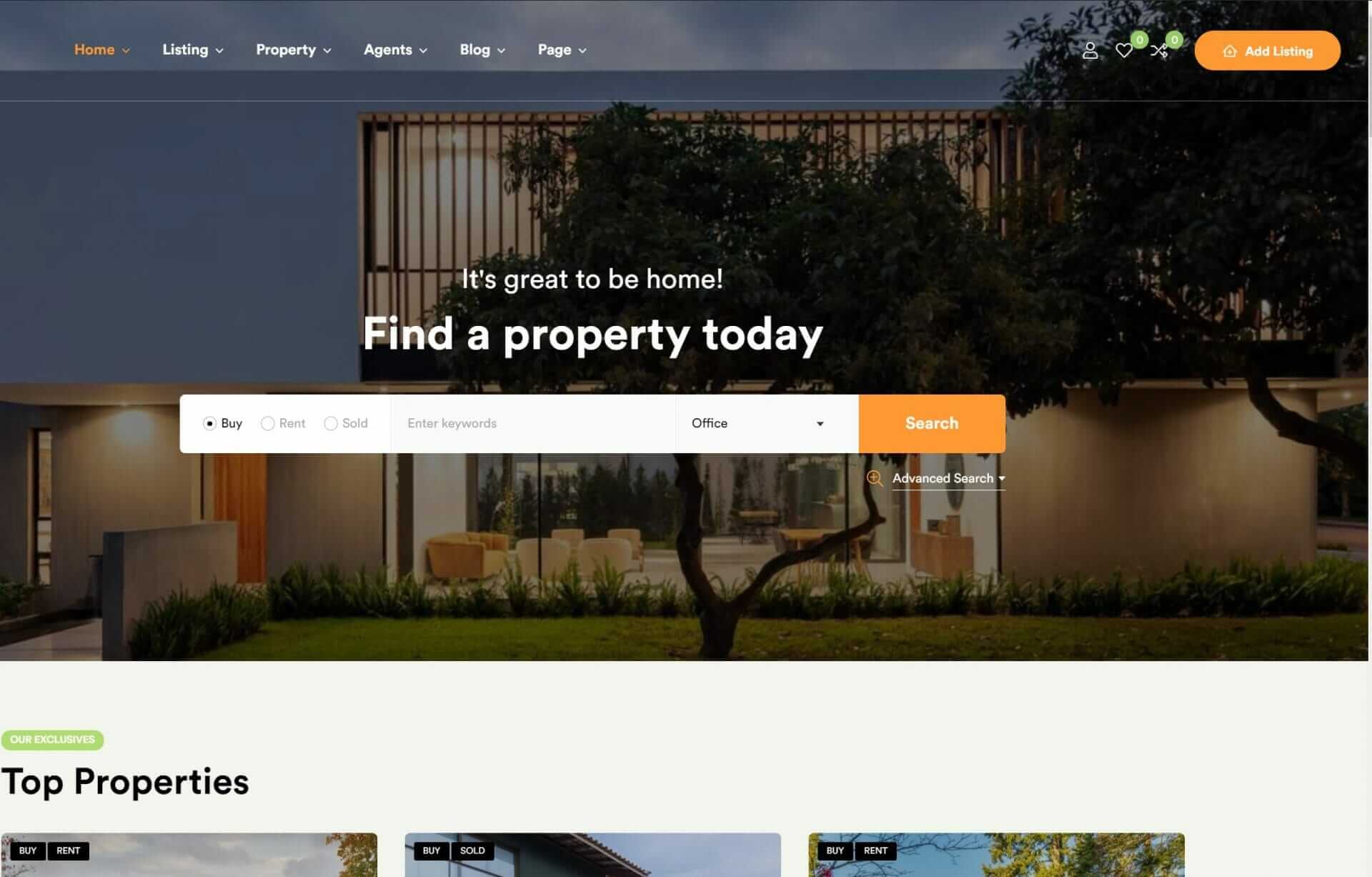
- Be consistent: Consistency in navigation design across pages helps users navigate with ease and reduces mental load. Use clear Calls-To-Action and consider incorporating sticky navigation bars or back-to-top buttons to enhance user experience.
Enhancing Navigation With Analytics

Analyzing user behavior with tools like Google Analytics reveals how your website’s navigation really works – and where it falls short. By leveraging analytics data, you’ll identify areas for improvement, such as popular pages, high bounce rates, and navigation bottlenecks. You’ll also track user interactions, time on page, and click-through rates to optimize navigation elements.
With A/B testing tools like Google Optimize, you can experiment with different navigation designs and measure user engagement. This data-driven approach enables you to continuously optimize website navigation for improved user experience and conversion rates.
As you explore analytics, you’ll uncover insights that inform navigation enhancements. You’ll learn how users navigate your site, what they’re looking for, and where they’re getting stuck. By optimizing navigation, you’ll streamline the user journey, reducing friction and increasing engagement.
With Google Analytics, you can track the impact of navigation changes on conversion rates, ensuring that your optimizations yield tangible results. By harnessing the power of analytics, you’ll create a navigation experience that truly resonates with your users. This, in turn, will boost user satisfaction, driving business success.
Crafting Intuitive Navigation Experiences

Crafting an intuitive navigation experience is essential to guiding your users seamlessly through your website and driving them toward their desired outcomes. By implementing user-friendly website navigation, you’ll not only enhance the overall user experience but also increase task success rates and conversion rates.
Here are three strategies to help you craft intuitive navigation experiences:
- Simplify Your Navigation Bars: By reducing the number of navigation options and using clear labels, you’ll make it easier for users to find what they’re looking for.
- Use Visual Hierarchy and Indicators: Effective use of visual hierarchy and visual indicators, such as breadcrumbs, can help users understand their current location and navigate your site more efficiently.
- Optimize Your Information Architecture (IA): A well-structured IA can streamline user journeys and improve overall user engagement, leading to higher conversion rates.
Optimizing Navigation for Mobile Devices

As you refine your website’s navigation experience, you should also consider the specific needs of mobile users, who now drive more than half of global internet traffic. This means you’ll want to prioritize a responsive design that adapts seamlessly to various screen sizes and resolutions on mobile devices.
A mobile-friendly navigation system is vital, featuring elements like collapsible menus, sticky headers, and swipe gestures that enhance the user experience on smartphones and tablets.
To guarantee your mobile navigation is on point, conduct usability testing on different mobile devices to identify and address any issues that are specific to mobile platforms. This will help you create a smoother user journey.
Don’t forget to prioritize quick access to essential information and clear calls-to-action on your mobile navigation – this will boost engagement and conversions on your mobile website.
To Recap
You’ve now got a solid grasp on top UX strategies to enhance website navigation. By implementing intuitive navigation experiences, you’ll not only boost user satisfaction but also increase conversions.
Did you know that 50% of website users will abandon a site if they can’t find what they’re looking for within 20 seconds? That’s a stark reminder of the importance of well-crafted navigation.
By applying these strategies, you’ll be well on your way to creating a seamless and user-friendly experience that drives real results.


