You’re looking to create a responsive website that adapts to various devices and screen sizes. To achieve this, you’ll need to incorporate seven key elements into your design strategy. Start with a flexible grid foundation, using relative units like percentages and ems to ensure scalability. Next, focus on intuitive navigation elements, responsive image optimization, and ample whitespace for readability. Consistency across devices is also essential, as is a mobile-friendly interface and adaptive content layout. By incorporating these elements, you’ll be well on your way to creating a seamless user experience – and that’s just the beginning of building a website that truly thrives.
Flexible Grid Foundation
To construct a responsive website, you need to establish a flexible grid foundation that defines the parameters for columns, spacing, and containers to ensure smooth adaptability across various devices. This foundation is the backbone of responsive web design, allowing your website to adjust seamlessly to different screen sizes and devices.
By creating a custom grid solution or utilizing existing grid systems with relative units like percentages and ems, you’ll guarantee that your website remains consistent and scalable.
Converting pixel measurements into relative units is a vital step in maintaining this consistency. It’s crucial to make this conversion to ensure that your website looks great on all devices, from smartphones to desktops.
With a flexible grid foundation in place, your website will be able to adjust smoothly to various browsing situations, providing a uniform user experience.
Intuitive Navigation Elements

As you design your responsive website, you’ll want to guarantee that your navigation elements are intuitive and user-friendly. This means creating a navigation menu design that’s easily accessible and understandable, regardless of the device or screen size.
Navigation Menu Design
How do you ensure that your navigation menu design is user-friendly and easy to understand across different devices and browser widths?
With responsive design, it’s important to think about how your navigation menus will adjust to various screen sizes and browser widths. You can’t simply shrink your navigation inappropriately; instead, you need to reconsider its layout and functionality for smaller screens.
Take inspiration from innovative websites like foodsense.is, which features top and centered navigation for mobile users. Observe how the navigation location adjusts to different browser widths to guarantee excellent usability? That’s what you should strive for in your own design.
Effective navigation elements are essential for creating an intuitive user experience in responsive design.
To achieve this, you need to evaluate the user experience across different devices and browsers. Ask yourself: how will my navigation menu design impact the overall user experience? Will it be easy to use on smaller screens?
Mobile Navigation Patterns
Building on the principles of user-friendly navigation menu design, you’ll want to explore effective mobile navigation patterns that help guide users to the content they need on smaller screens. This is essential for providing a seamless browsing experience on smartphones and tablets.
You see, intuitive navigation elements like menus play a significant role in guiding users to desired content on these smaller screens. By implementing a well-designed navigation layout, you’ll guarantee easy access to information and enhance user engagement.
Brad Frost offers valuable insights on creating intuitive menus for responsive web design. He emphasizes the importance of focusing on intuitive navigation to improve user experience and reduce bounce rates.
In your responsive design, consider how users interact with your site on various devices. Effective mobile navigation patterns prioritize simplicity, clarity, and ease of use. As you design your mobile navigation, prioritize intuitive elements that facilitate a smooth user journey.
Navigation Bar Placement
Your website’s navigation bar placement plays a significant role in delivering a seamless user experience across various devices and screen sizes. In responsive web design, an intuitive navigation bar placement is important for guaranteeing that users can easily access your website’s content, regardless of the device they’re using.
By placing navigation elements strategically, you can prevent users from getting frustrated with your website, which can negatively impact user engagement.
For instance, placing your navigation bar at the top and center of your website can enhance user engagement, especially for mobile users. A great example of this is the website foodsense.is, which has a clean and user-friendly navigation bar that makes it easy for users to find what they’re looking for.
Additionally, making adjustments to your navigation bar’s location across different screen sizes can improve site navigability. Consistency is key, so make sure that your navigation layout remains the same regardless of browser width to prevent scaling issues and enhance user interaction.
Responsive Image Optimization

What sets a responsive website apart is its ability to deliver high-quality images quickly, making image optimization an essential step in the design process.
When you optimize your images, you’re not just reducing file sizes – you’re improving page loading speed and user experience. Let’s face it: loading time is a major influencer of user patience and engagement. If your images take too long to load, users will bounce.
To optimize your images, consider using tools like TinyPNG, which can reduce file sizes without compromising quality. This is especially vital for mobile connections, where loading times can be sluggish.
By optimizing your images, you’ll not only enhance user experience but also contribute to faster page loading times on various devices. Responsive design benefits from optimized images, ensuring a seamless browsing experience across different screen sizes.
Whitespace and Readability
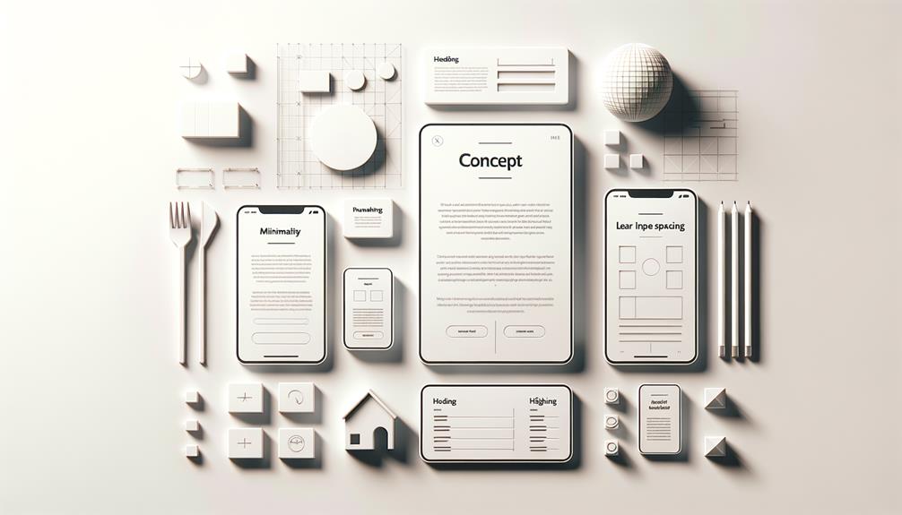
As you design a responsive website, incorporating ample whitespace is necessary for guiding the user’s attention through your content and cultivating a seamless reading experience across various devices. Whitespace provides visual breathing space, allowing your content to take center stage. You’re not just creating empty space; you’re crafting a clear visual hierarchy that enhances focus on your message.
When adjusting your design for smaller screens, don’t forget to tweak padding and margins to maintain readability on mobile devices.
A responsive design should also consider font sizes and spacing. You want these elements to adapt effortlessly across different devices, so your users enjoy an ideal reading experience. Trust your instincts to maintain a comfortable amount of whitespace – it’s vital for a positive user experience.
By doing so, you’ll not only improve readability but also boost user engagement. A clutter-free website is a haven for users, making it easier for them to absorb your content. By prioritizing whitespace and readability, you’re one step closer to creating a responsive website that truly captivates your audience.
Consistency Across Devices
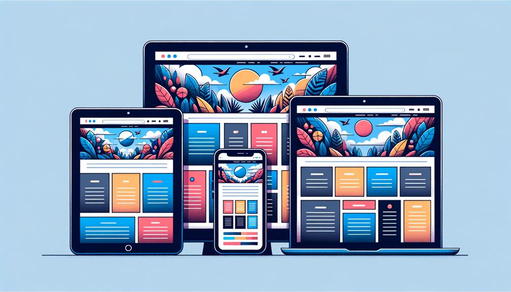
Crafting a consistent browsing experience across devices is essential to preventing visitor frustration and reducing bounce rates. When your website’s layout, navigation, and content are consistent, your visitors can easily find what they need, no matter the device they’re using. To achieve this consistency, you’ll want to focus on three key elements:
- Flexible layouts: Your website’s layout should adapt to different screen sizes and devices, ensuring that your content is always displayed in a clear and organized manner.
- Fluid grids: A fluid grid system allows your website’s elements to resize and reorganize themselves based on the device being used, ensuring that your content is always easily accessible.
- Consistent mobile-first design: By designing with mobile devices in mind first, you’ll create a website that’s optimized for smaller screens and can then be easily scaled up for larger devices, ensuring a seamless user experience across all devices.
Mobile Friendly Interface

Your website’s mobile-friendly layout is now a crucial determinant of its online success, as it directly impacts user engagement, credibility, and search engine rankings. With mobile users surpassing desktop users, it’s essential that your website is tailored for mobile devices.
A mobile-friendly layout enhances user experience, allowing visitors to easily navigate and access your site’s content. This, in turn, boosts credibility and increases the likelihood of converting visitors into customers.
Google prioritizes mobile-friendliness when ranking websites, making it a crucial factor for online visibility and success. By investing in a responsive website design, you can guarantee that your site adapts seamlessly to different devices and screen sizes. This not only improves user experience but also helps you reach a wider audience and drive more traffic to your site.
With responsive designs that adapt to various devices, you can provide an excellent browsing experience for your users, regardless of how they access your site. By prioritizing mobile-friendliness, you can stay ahead of the curve and achieve online success.
Adaptive Content Layout

Building on the foundation of a mobile-friendly interface, you can further enhance user experience by incorporating an adaptive content layout that adjusts seamlessly to various devices and screen sizes. With an adaptive layout, you make sure that your website’s content is displayed efficiently, regardless of the device used to access it.
To achieve this, you’ll need to harness the power of flexible grids and media queries, key elements of responsive design that allow your content to fluidly adapt to different screens.
Here are three essential aspects to keep in mind when creating an adaptive content layout:
- Content flow: Ensure that your content is easily readable and accessible on various devices, with clear headings, concise paragraphs, and strategically placed calls-to-action.
- Spacing and sizing: Strike a balance between text size, line height, and spacing to maintain a visually attractive and easy-to-digest layout.
- Alignment and consistency: Use a uniform grid system to align content elements and maintain a coherent design, even as the layout adjusts to different screens.
To Recap
As you design your responsive website, remember that a mobile-friendly interface and adaptive content layout can make all the difference between a user-friendly experience and a frustrating one.
By incorporating elements like flexible grids, intuitive navigation, and responsive images, you’ll be well on your way to creating a seamless user experience that translates across devices.
So, ditch the outdated, cluttered designs and opt for a clean, consistent look that prioritizes whitespace and readability.


