When selecting colors for effective website branding, you’re making a pivotal decision that can either enhance or hinder your online presence. Understanding color theory is essential to creating a visually appealing website that evokes the appropriate emotions. You’ll want to take into account the color wheel, color psychology, and contrast to develop a unified color scheme that boosts your brand recognition and recall. A well-designed color palette can even impact consumer perception and cultivate brand loyalty. By choosing primary, secondary, and accent colors strategically, you can establish a cohesive visual identity that represents your brand effectively – and that’s just the beginning.
Color Theory in Web Design
When it comes to creating a visually appealing website, understanding color theory is essential, as it helps you select harmonious color palettes that enhance brand recognition and evoke the right emotions in your users.
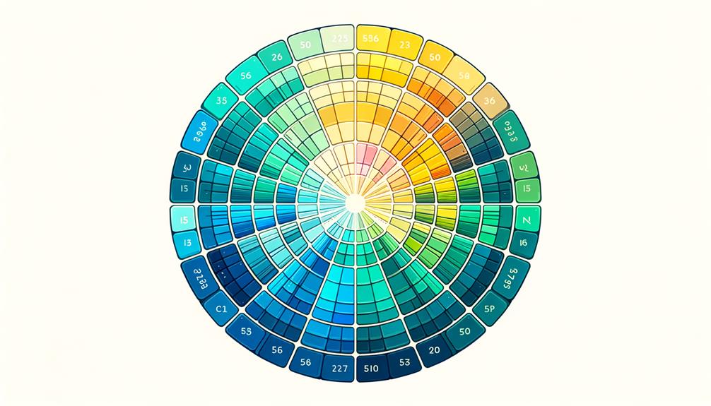
You’ll want to familiarize yourself with the color wheel, which is the foundation of color theory. By understanding how colors relate to each other on the wheel, you can create effective color schemes – like monochromatic, complementary, and analogous – that enhance your brand’s visual identity.
As you explore color theory, you’ll also want to investigate color psychology, which helps you choose colors that elicit specific emotions and influence user perception. For instance, blue is often associated with trust, while orange is linked to creativity. By applying color psychology principles, you can create a website that resonates with your target audience.
Don’t forget about color contrast, which is essential for readability, legibility, and overall user experience. By balancing color contrast, you can guarantee that your website is both visually appealing and easy to navigate.
Importance of Website Color Schemes

As you develop your brand’s visual identity, a well-crafted website color scheme plays a vital role in shaping your audience’s perception and recall of your brand. You want to make a lasting impression, and color schemes can enhance brand recognition and recall by up to 80%.
The emotions evoked by colors influence how visitors perceive your website and brand, making it essential to choose effective color schemes that convey your brand messaging and set the tone for your website. Well-chosen website color palettes can create a visually appealing and memorable experience for your users.
In web design, using complementary colors can significantly impact user engagement and brand perception. By selecting colors that complement each other, you can create a harmonious visual identity that reinforces your brand.
A thoughtfully designed color scheme is vital for building a strong brand identity. It’s not just about picking colors you like; it’s about creating an emotional connection with your audience. By investing time in crafting a well-designed color scheme, you’ll be rewarded with a website that truly represents your brand and resonates with your audience.
Creating a Color Palette Strategy

To turn your brand’s visual identity into a cohesive online presence, you’ll need a color palette strategy that balances creativity with consistency. Start by selecting a primary color that dominates 60% of your website, establishing a strong visual identity.
Then, choose secondary colors that complement the primary color, occupying 30% of the website. These colors will add depth and balance to your color palette.
Finally, incorporate an accent color that contrasts with the primary color, utilizing 10% of the website for emphasis.
This 60/30/10 rule will guide you in creating a harmonious and visually appealing color palette strategy. Consistent color choices across your website will enhance brand recognition and create a cohesive visual experience.
By applying this rule, you’ll create a color palette that’s both aesthetically pleasing and effective in communicating your brand’s message. A well-designed color palette strategy will set your website apart from the competition and leave a lasting impression on your users.
With a solid color palette strategy in place, you’ll be able to create a website that truly reflects your brand’s personality and values.
Color Psychology and Branding

Because emotions play a significant role in consumer decision-making, understanding the psychology behind color choices is crucial for effective branding that resonates with your target audience. Color psychology studies how specific colors evoke emotions and associations that can influence consumer perception.
By harnessing this knowledge, you can create a visual identity that communicates your brand’s values and personality, fostering brand recognition and loyalty.
Different colors convey various meanings – red for energy and passion, blue for trust and reliability, and green for nature and sustainability. Consistently using colors that align with your brand’s values and personality can create a strong emotional connection with your audience.
Choosing Primary and Secondary Colors

By applying the principles of color psychology to your branding strategy, you’re ready to select a palette that brings your brand to life, starting with the core elements: primary and secondary colors. Your primary colors will set the tone for your brand’s visual identity, making up 60% of your website’s color palette to establish a dominant visual presence.
Secondary colors, on the other hand, will complement your primary colors, comprising 30% of the palette to create a cohesive look. To strike a balance between primary and secondary colors, follow the 60/30 rule for a harmonious color scheme. This ratio will help you create a clear visual hierarchy, drawing users’ attention to key elements on your website.
Secondary colors play an essential role in enhancing the overall aesthetic appeal and visual hierarchy of your website, so choose them strategically. By selecting colors that complement each other, you’ll create a visually engaging and memorable brand identity.
A strategic combination of primary and secondary colors will elevate your brand’s visual appeal, making it more recognizable and impactful. With a thoughtful approach, you’ll craft a palette that brings your brand to life and resonates with your audience.
Effective Color Combinations for Websites

Your website’s color combination can make or break its visual appeal, with a well-chosen palette boosting brand recognition by up to 80%.
When selecting a color scheme, you want to create an emotional connection with your visitors. To achieve this, consider the following key principles:
- Complementary colors: Pair colors that are opposite each other on the color wheel to make your primary colors pop.
- Consistent color schemes: Use a consistent palette throughout your website to enhance brand recognition and memorability.
- Color contrasts: Balance warm and cool colors to create visual interest and highlight important elements.
- Color psychology: Choose colors that evoke the desired emotional responses from your visitors, such as blue for trust or orange for energy.
Role of Accent Colors in Design

Now that you’ve established a solid color palette, it’s time to think about how accent colors can elevate your website’s design.
You’ll want to strategically choose an accent color that complements your primary color and enhances your overall branding, as it will play a key role in drawing attention to important elements and guiding users’ focus.
Accent Color Techniques
Selecting one to three accent colors is an important step in designing a visually appealing and effective website, as they direct users’ attention to specific elements and create visual interest.
You want to choose colors that not only reflect your brand but also guide users to important information on your website. When used strategically, accent colors can enhance brand recognition and improve user experience.
To get the most out of your accent colors, consider the following techniques:
- Create contrast: Choose accent colors that contrast with your primary colors to create a dynamic and engaging design.
- Draw attention: Use accent colors to draw attention to specific elements, like buttons or calls to action.
- Enhance visual interest: Use accent colors to add visual interest to your website and guide users to important information.
- Influence user behavior: Use accent colors strategically to influence user behavior and increase conversions on your website.
Balancing Accent Colors
To strike the right balance, accent colors should be used sparingly, making up no more than 10% of your website’s design to avoid overwhelming the user and maintain a clear visual hierarchy. You want to create visual interest, not visual chaos. By using accent colors thoughtfully, you’ll draw attention to specific areas or calls to action, enhancing brand recognition and improving user experience.
When selecting accent colors, consider how they complement your primary color palette. You want to add a pop of contrast, not clash with your existing colors. Limiting the number of accent colors is also vital to maintain a cohesive and harmonious design aesthetic. Too many accent colors can dilute your brand’s visual identity and confuse users.
Tools for Selecting Website Colors

When building your website’s brand, utilizing specialized tools like Adobe Color and Coolors can help you create a cohesive color palette that resonates with your target audience. These innovative tools assist in selecting colors that reflect your brand’s personality and values.
For instance, you can use tools like HueSnap, Palettr, and Canva Color Palette Generator, which offer unique features to aid in color selection.
To guarantee accessibility and readability, consider using Color Safe.
Here are 4 key tools to enhance your color selection process:
- Khroma: Generates color schemes based on specific branding needs.
- Color Space: Offers a range of color palettes tailored to different design styles.
- Paletton: Creates harmonious color combinations.
- Adobe Color: Allows real-time color palette creation.
Once you’ve chosen your colors, save the hex codes to maintain consistency across your website. This helps to establish a strong visual identity and reinforces your website’s branding.
Best Practices for Color Consistency

Your website’s color palette sets the foundation for a strong visual identity, and maintaining consistency is vital to reinforcing your brand’s message.
By utilizing a uniform color scheme throughout your website, you can boost brand recognition by up to 80%. Consistency in color aids in conveying a unified brand identity to your visitors, facilitating their connection with your brand.
To achieve color uniformity, use contrasting colors strategically to enhance visual interest and emphasize important elements. Guarantee clarity in typography and color selections to ensure readability and a polished appearance.
Harmonize vibrant colors with neutral tones to craft a visually appealing design. A well-planned color palette can enhance your brand’s online presence and leave a lasting impact.
To Recap
As you finalize your website’s color scheme, remember that the true test of effectiveness lies ahead.
Will your chosen colors resonate with your target audience, or will they fall flat?
By applying the principles of color theory, psychology, and branding, you’ve taken a vital step towards success.
But the real litmus test begins when users interact with your site, and only time will reveal whether your color choices foster engagement, conversions, or merely fade into the background.


