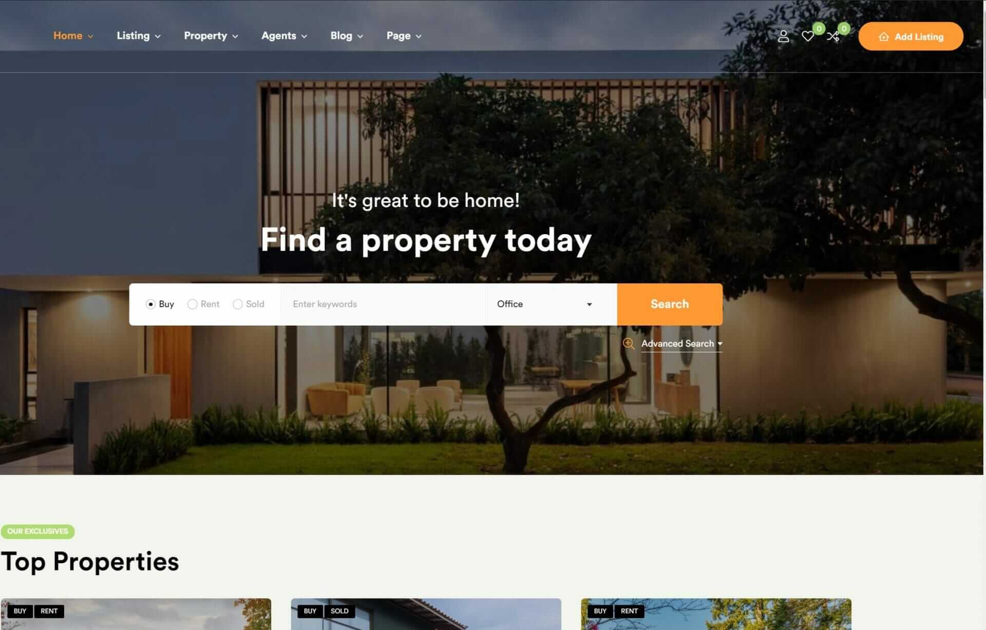
To effectively implement responsive design, you’ll need to master five key steps. First, set media query ranges that cater to your unique design needs and breakpoints, guaranteeing consistency across various screen sizes. Next, create a flexible grid system using relative units like percentages to adapt your layout. Then, implement responsive images techniques, such as using the srcset attribute or picture element, and prioritize performance with lazy loading and compression. You’ll also need to use responsive typography methods, like fluid typography, to guarantee text adapts to screen sizes. By mastering these steps, you’ll be well on your way to accessing a seamless user experience.
Set Media Query Ranges Effectively
When implementing responsive design, setting effective media query ranges is vital, as it allows you to tailor your CSS styles to specific devices and screen sizes.
You’ll want to set these ranges based on your unique design needs and breakpoints, which determine when different CSS styles are applied to elements. Common breakpoints include those for tablets, desktops, and specific mobile models.
By setting effective media query ranges, you guarantee a smooth progression of design elements across various devices.
As you set your media query ranges, you’ll need to test them to confirm they’re working as intended. Tools like Google’s mobile-friendly test can help you validate your ranges and identify any issues.
This testing process is essential in ensuring that your design looks and functions great on all devices. Don’t be afraid to tweak your media query ranges as needed to achieve the best results.
With effective media query ranges in place, you’ll be well on your way to creating a responsive design that truly shines. By taking the time to get this step right, you’ll set yourself up for success in the long run.
Create a Flexible Grid System

With effective media query ranges in place, you can now focus on building a flexible grid system that uses relative units like percentages to create adaptable layout structures that scale seamlessly across different screen sizes. This approach allows website elements to adjust proportionally to the screen width, guaranteeing a consistent and visually appealing layout across devices.
By using a flexible grid system, you’ll maintain design integrity and readability on various devices, from desktops to smartphones.
A flexible grid system is the foundation for creating fluid and dynamic layouts that can easily scale and reorganize based on the viewing environment. This means that your website will provide a seamless and user-friendly experience on all devices.
As you design, you’ll want to make sure that your layout structures are adaptable and can respond to different screen sizes. By doing so, you’ll create a website that’s both visually appealing and functional, regardless of how users access it.
With a flexible grid system in place, you’ll be one step closer to achieving a responsive design that meets the needs of your users.
Implement Responsive Images Techniques

To secure your images adapt seamlessly to different screen sizes and devices, you’ll need to implement responsive images techniques that prioritize flexibility and performance. This approach guarantees your site’s visuals remain crisp and clear, whatever the device.
Implementing responsive images involves using the `srcset` attribute to provide different image sizes for various devices. You can also use the `<picture>` element to specify multiple image sources based on device resolution.
Here are key techniques to make your images responsive:
- Use the `srcset` attribute to provide multiple image sizes.
- Implement the `<picture>` element to specify multiple image sources.
- Set `max-width: 100%` in CSS to secure proportional scaling.
- Use lazy loading images to improve site performance by loading images when they come into view.
Use Responsive Typography Methods

Building on your responsive images techniques, you’ll also want to implement responsive typography methods to guarantee your site’s text adapts seamlessly to different screen sizes and devices. With responsive typography, you’ll ensure that your font sizes and spacing adjust to provide optimal readability and legibility on various devices.
To achieve this, you can use fluid typography techniques like relative units (em, rem), which allow your text to scale appropriately with different screen sizes.
Media queries also play an essential role in responsive typography, as they enable you to tailor your font styles and sizes based on the viewport width. By considering the viewport width, you can adjust your typography to maintain a clear visual hierarchy and ensure your text remains readable.
Don’t forget to balance line length, line height, and font choices to create a harmonious and readable experience. By implementing responsive typography methods, you’ll enhance your site’s user experience, providing a consistent and visually appealing text display across devices.
This attention to detail will elevate your site’s overall design and make it more engaging for users.
Test Responsiveness Across Devices

How do you ensure that your responsive design delivers a seamless user experience across various devices, from smartphones to desktop computers? To guarantee a consistent experience, you need to test responsiveness across devices. Start by utilizing tools like Google’s mobile-friendly test and Chrome developer tools to evaluate how your website adapts to different screen sizes.
You’ll also want to check the responsiveness of your design on popular browsers like Chrome, Firefox, Safari, and Edge to cover a wide range of user experiences.
Here are some ways to test responsiveness:
- Use Google’s mobile-friendly test to check for mobile usability issues.
- Inspect your website’s layout with Chrome developer tools.
- Conduct user testing on real devices to gather feedback.
- Analyze data from Google Analytics to see the distribution of user devices.
To Recap
By following these five key steps, you’ll be well on your way to creating a responsive design that’ll make your website look like a million bucks – literally, it’ll be so good you’ll feel like you’ve struck gold!
With a solid foundation in media queries, flexible grids, responsive images, and typography, as well as thorough testing across devices, you’ll be able to create a user experience that’s seamless, intuitive, and ridiculously effective.


