When designing a website, you’re not just choosing colors that look good – you’re shaping the user experience and influencing emotions. Color psychology plays an essential role in creating an emotional connection with your audience, driving engagement, and ultimately, conversions. Strategic color choices can boost website engagement and conversion rates, while consistent use of brand colors can foster brand loyalty and recognition. By understanding how colors evoke emotions and convey brand identity, you can make informed design decisions that impact user interactions. As you explore the intersection of color psychology and web design, you’ll discover how to harness the power of color to drive real results.
Understanding Color Psychology Basics
When designing a website, understanding the basics of color psychology is fundamental, as the colors you choose will evoke emotions and reactions in your users. You see, color psychology plays a significant role in shaping user emotions and behaviors. Different colors can spark specific reactions and perceptions, making it essential to pick the right palette for your brand.
By grasping the fundamentals of color psychology, you can enhance user experience and create a website that truly resonates with your audience. Colors can convey your brand identity, values, and messaging more effectively than words alone. Strategic color choices can even boost website engagement and conversion rates.
Think of color psychology as a tool to communicate with your users on a deeper level. It’s not just about aesthetics; it’s about creating an emotional connection with your audience. When you choose colors that align with your brand’s values and personality, you’re more likely to build trust and loyalty with your users. By incorporating color psychology into your design process, you can create a website that truly speaks to your audience and sets your brand apart.
Impact of Colors on Emotions
As you create your website, you’re probably thinking about how to make a lasting impression on your visitors.
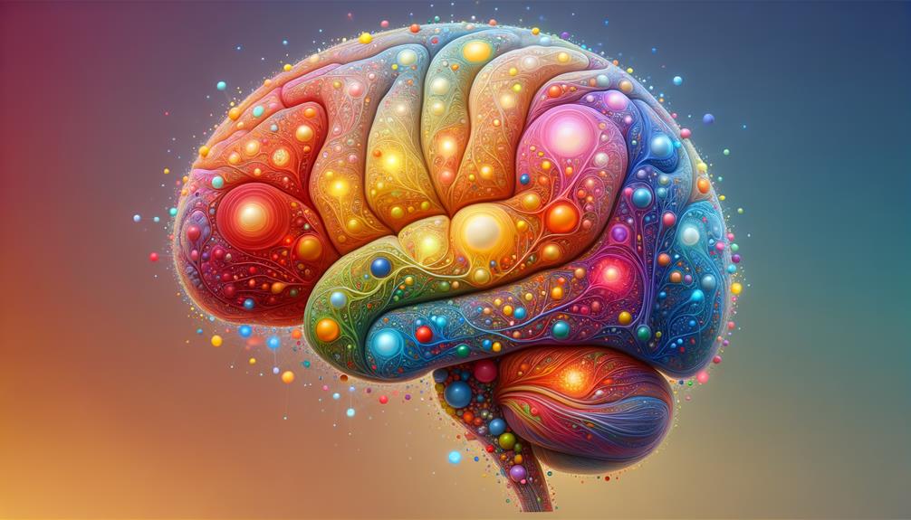
One essential element to keep in mind is the impact of colors on emotions – after all, the colors you choose can evoke feelings, stimulate reactions, and influence user experiences.
Color and Emotional Triggers
By leveraging the emotional power of color in web design, you can create a visceral connection with your users, influencing how they feel and interact with your website. Color psychology plays a pivotal role in shaping user experience, as different colors evoke specific emotions in users.
For instance, blue promotes trust, while red triggers urgency and excitement. Understanding these color meanings allows you to design a website that elicits the desired emotional response from your visitors.
When you strategically apply color psychology principles, you can create a visually appealing website that resonates with users on an emotional level. Colors like yellow are associated with happiness, while green can symbolize nature and growth in web design.
Psychological Effects of Colors
Colors can have a profound impact on your users’ emotions, with different hues evoking distinct feelings and reactions that can greatly influence their interactions with your website. By leveraging color psychology in your website design, you can create an emotional connection with your audience and enhance their overall user experience. The impact of color on emotions is an important aspect of web design, and choosing the right color scheme can make all the difference.
For instance, incorporating calming colors like blue and green can convey trust and serenity, making them perfect for websites that require users to share personal information or make transactions. On the other hand, bold colors like red can evoke specific emotional responses, such as energy and passion, ideal for call-to-action buttons or promotions.
Your brand perception is also closely tied to the colors you choose, so it’s vital to select hues that align with your values and personality. By understanding the psychological effects of colors, you can create a website design that resonates with your audience and leaves a lasting impression. Remember, color psychology plays a significant role in shaping the overall user experience.
Color-Induced Emotional Responses
How do different hues affect your users’ emotional state, and what role can you play in harnessing this impact to create a more engaging website experience? Leveraging color psychology is key to understanding the emotional responses that various colors evoke. You can influence your users on a subconscious level by selecting colors that align with your brand’s message and values.
Here’s a snapshot of how colors can shape user experiences:
| Color | Emotional Response | Website Application |
|---|---|---|
| Blue | Trust and Calmness | Financial institutions, Health services |
| Red | Excitement and Urgency | Call-to-action buttons, Promotions |
| Yellow | Happiness and Optimism | Entertainment, Lifestyle brands |
| Green | Nature and Growth | Eco-friendly, Health-related websites |
Role of Color in Branding

When you’re building your brand, you’ll want to choose colors that align with your brand’s identity and desired perception. After all, the colors you select will influence how consumers perceive and interact with your brand.
As you consider the role of color in your branding strategy, you’re making decisions that will shape your brand’s recognition and emotional connection with your audience. By thoughtfully selecting your brand colors and using them consistently, you’ll be creating a visual language that communicates your brand’s values and helps you stand out in a competitive market.
Color and Brand Identity
In creating a strong brand identity, your choice of color plays a vital role in differentiating your brand and conveying the desired emotions to your target audience. You’ll want to select colors that not only reflect your brand’s personality but also resonate with your users.
Brand colors can increase recognition by up to 80% and influence purchasing decisions, making them an important aspect of your overall brand strategy.
Consistent use of brand colors across various platforms can boost revenue by 23%, which is a significant increase. Additionally, 85% of consumers cite color as the main reason for purchasing a product, highlighting the emotional impact of color on user experience.
By making strategic color choices, you can effectively convey the desired emotions and build trust with your audience.
The strategic use of color contrast, cultural connotations, and color psychology principles can help you create a unique brand identity. This, in turn, fosters brand recognition, loyalty, and ultimately, drives business growth.
Psychology of Color Choices
As you shape your brand identity, understanding the psychology behind color choices becomes essential in creating a lasting impression on your target audience. Color psychology plays a significant role in branding, influencing consumer behavior and emotions.
With 93% of consumers focusing on visual appearance when making a purchase decision, you can’t afford to overlook strategic color choices. By selecting colors that evoke the right emotions and perceptions, you can increase brand recognition by up to 80%, ultimately driving customer loyalty and trust.
Different industries use specific colors to align with their target audience and values. For instance, healthcare companies often use calming colors like blue and green to convey a sense of serenity and trust. By understanding your target audience’s preferences and values, you can make informed color choices that resonate with them.
Brand Color Consistency
Across all marketing channels, maintaining consistent brand colors is essential for building a strong visual identity that fosters trust and loyalty with your target audience. You want to create an instantly recognizable brand, and consistent colors play a huge role in that. By using the same colors across all platforms, you can increase brand recognition by up to 80% and build trust with consumers, ultimately fostering brand loyalty.
But that’s not all – consistent brand colors can also influence purchase decisions for 85% of consumers. When you use the same colors everywhere, you create a cohesive look that makes your brand feel more professional and reliable. And, as a result, 60% of consumers are more likely to engage with your brand.
The benefits don’t stop there; consistency in brand colors can even lead to a 23% increase in revenue. By leveraging color psychology in your web design, you can create a user experience that resonates with your target audience and drives real results.
Creating Harmonious Color Schemes
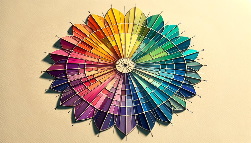
By carefully choosing colors that work well together, you can create a harmonious color scheme that enhances the overall visual appeal of your website. To achieve this, you’ll want to tap into color theory principles, such as complementary, analogous, or monochromatic schemes, to craft a palette that’s both visually pleasing and cohesive.
Balancing warm and cool tones within your color scheme can evoke different emotions and enhance user experience. When designing your harmonious color scheme, be sure to use colors consistently throughout your website. This will help maintain visual harmony and guide users’ attention to key elements.
Consistency is key to creating a cohesive look that ties your entire website together. By achieving this unity, you’ll not only improve aesthetics, but also create a sense of professionalism and credibility. A well-designed color scheme can work wonders for your website, so don’t be afraid to experiment and find the perfect balance of colors that will leave a lasting impression on your users.
With harmonious color schemes, you can create a website that’s both beautiful and effective.
Colors and User Engagement

When it comes to capturing users’ attention, colors play an important role in influencing their emotions and shaping their perceptions of your website.
You can leverage color psychology to boost user engagement and create a lasting impression. Colors like blue, for instance, can convey trust and professionalism, making users more likely to interact with your site.
On the other hand, red can create a sense of urgency or excitement, prompting users to take action.
Cultural Significance of Colors

As you work to enhance user engagement through color psychology, it’s also essential to take into account the cultural significance of colors, which can greatly impact how your website is perceived by a global audience.
Colors can have diverse cultural interpretations, and what might signify luck in one culture could symbolize mourning in another. For instance, red is a lucky color in Chinese culture, but it represents mourning in South Africa.
When designing for a global audience, it’s important to balance your color choices to accommodate these varying interpretations.
Understanding the positive connotations of specific colors in different cultures is key to effective cross-cultural design. You want to make sure that the colors you choose don’t have contrasting meanings that could influence user perceptions and interactions.
For example, while white signifies purity in Western cultures, it represents mourning in some Eastern cultures.
By being aware of these cultural differences and balancing your colors accordingly, you can create a website that resonates with users from diverse backgrounds, enhancing their overall experience.
This thoughtful approach will help you navigate the complexities of cross-cultural design and make informed color choices that support your global audience.
Colors for Accessibility and Inclusivity
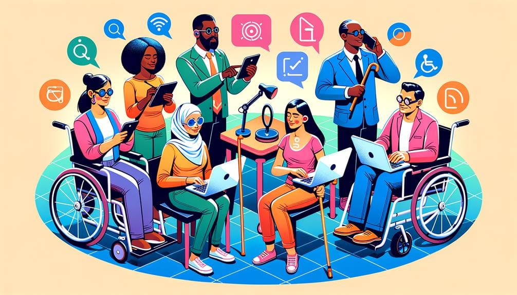
Selecting colors that prioritize accessibility and inclusivity is crucial to creating a website that effectively engages users with diverse visual abilities and needs. You want to make sure that your design caters to users with visual impairments, which is where high color contrast comes in – it enhances readability and accessibility.
Consider color blindness, too, by incorporating patterns, labels, or icons to convey information effectively. Accessibility standards recommend a minimum contrast ratio of 4.5:1 for text and images to be easily readable.
Designing with inclusivity in mind involves selecting colors that cater to a diverse range of visual abilities. Tools like Color Safe can assist you in choosing accessible color palettes for better inclusivity in web design. By using these tools and considering accessibility standards, you can create a website that’s usable by everyone.
Prioritize accessibility and inclusivity in your web design, and you’ll be rewarded with a more engaging user experience. With a little creativity and the right tools, you can create a website that truly is for everyone.
Optimizing Colors for Conversion

By harnessing the psychological power of color, you can optimize your website’s design to drive conversions and boost user engagement. Colors have a profound impact on user behavior, influencing emotions, perceptions, and actions.
To tap into this potential, consider the role of warm colors in creating a sense of urgency and excitement. For instance, using red or orange for call-to-action buttons can increase conversion rates by prompting users to take immediate action.
A/B testing different color schemes can help you determine which combination resonates best with your target audience, leading to higher conversion rates. By understanding the psychological impact of colors, you’ll make strategic color choices that drive conversions and optimize user experience.
Don’t underestimate the power of color contrast, either – it can improve visibility and user interaction for important elements like buttons and links.
Through informed color choices, you can build trust, evoke emotions, and create an immersive experience that resonates with your audience. By leveraging color psychology in web design, you’ll enhance user experience, drive conversions, and ultimately, boost your bottom line.
To Recap
As you harness the power of color psychology in web design, you’re not just creating a visually appealing experience – you’re crafting an emotional connection with your users.
By understanding the subtle nuances of color and its impact on user emotions, you can carefully curate a harmonious color scheme that resonates with your brand’s message and values, ultimately driving engagement, inclusivity, and conversion.
Your design becomes a symphony of color and psychology.


