When designing a website, you can greatly influence user experience by integrating specific colors that evoke emotions, convey meaning, and create visual harmony. Blue establishes trust and stability, while green represents nature and growth. Yellow creates a positive and uplifting atmosphere, and orange boosts user engagement and enthusiasm. Purple conveys luxury and wisdom, and pink evokes femininity and beauty. Turquoise inspires creativity and innovation, and black conveys elegance and sophistication. White creates a clean and minimalist aesthetic. By understanding the psychology behind these colors, you can tap into the full potential of your website and create a more engaging user experience.
Blue for Trust and Stability
When designing your website, you can leverage blue to establish a sense of trust and stability with your users. This color is commonly used in web design for its association with reliability and professionalism. Studies show that blue is a preferred color for many users, promoting a sense of security and credibility. You can use blue to create a calming and soothing atmosphere, making it ideal for creating a positive user experience on your website.
Brands like Facebook, Twitter, and LinkedIn use blue in their design to convey trustworthiness and credibility. The color blue is versatile and can be used in various shades to evoke different emotions while maintaining a sense of dependability in web design.
Whether you’re designing a corporate website or a social media platform, blue can help you establish a sense of trust and stability with your users. By incorporating blue into your design, you can create a professional and reliable atmosphere that promotes a positive user experience. With its calming effects and association with trust, blue is a great choice for any web design project.
Green for Nature and Growth

By incorporating green into your web design, you can tap into the calming and balancing effects of this natural color, creating a sense of growth and harmony that resonates with users.
Green is often associated with nature, growth, and tranquility, making it a popular choice for websites related to environmental causes or wellness. Studies have shown that the color green can have a calming effect on users, making it suitable for designs aiming to create a sense of balance and harmony.
As a champion of sustainability and eco-friendliness, green is also a favorable choice for brands focusing on environmental responsibility.
Incorporating shades of green in web design can evoke feelings of freshness, renewal, and health, appealing to users seeking a natural and organic experience.
Additionally, the color green can symbolize prosperity and abundance, making it a versatile choice for websites related to finance, wealth, or growth-oriented industries.
Yellow for Happiness and Energy

As you design your website, you’re probably looking for ways to create a positive and uplifting user experience – and that’s where yellow comes in.
By leveraging yellow’s association with happiness and energy, you can craft an atmosphere that stimulates engagement and encourages users to take action.
Let’s explore how yellow’s positive emotional associations and effective color combinations can enhance your website’s UX and leave a lasting impression on your visitors.
Positive Emotional Associations
Embracing the vibrant and uplifting qualities of yellow in your web design can create a powerful emotional connection with your users. By incorporating this energetic color, you’ll evoke feelings of happiness, energy, and positivity, setting the tone for an engaging and interactive experience. Yellow also stimulates mental activity, increasing users’ attention span and encouraging them to explore your site further.
As you design with yellow, you’ll convey warmth, optimism, and creativity, making your brand feel friendly and welcoming. This is especially essential for call-to-action buttons, as yellow’s vibrant tone can’t be missed, prompting users to take action.
By leveraging yellow’s emotional associations, you’ll create a user experience that’s both enjoyable and effective. Your users will appreciate the inviting atmosphere, and your brand will benefit from increased interaction and engagement.
Effective Color Combinations
Now that you’ve harnessed the power of yellow to create a positive emotional connection with your users, it’s time to explore how combining yellow with other colors can further enhance the user experience and create a visually appealing design.
When paired with blue, yellow creates a harmonious balance that evokes feelings of joy and trust. Adding gray to the mix helps to tone down the brightness of yellow, creating a more subtle and sophisticated visual effect.
As you experiment with different color combinations, remember that yellow can stimulate mental activity and guide users’ focus. Use it strategically to improve readability and create a welcoming online environment.
By balancing yellow with other colors, you can create a design that’s both engaging and easy to navigate. For example, using yellow for calls-to-action and blue for backgrounds can create a clear visual hierarchy that drives user interaction.
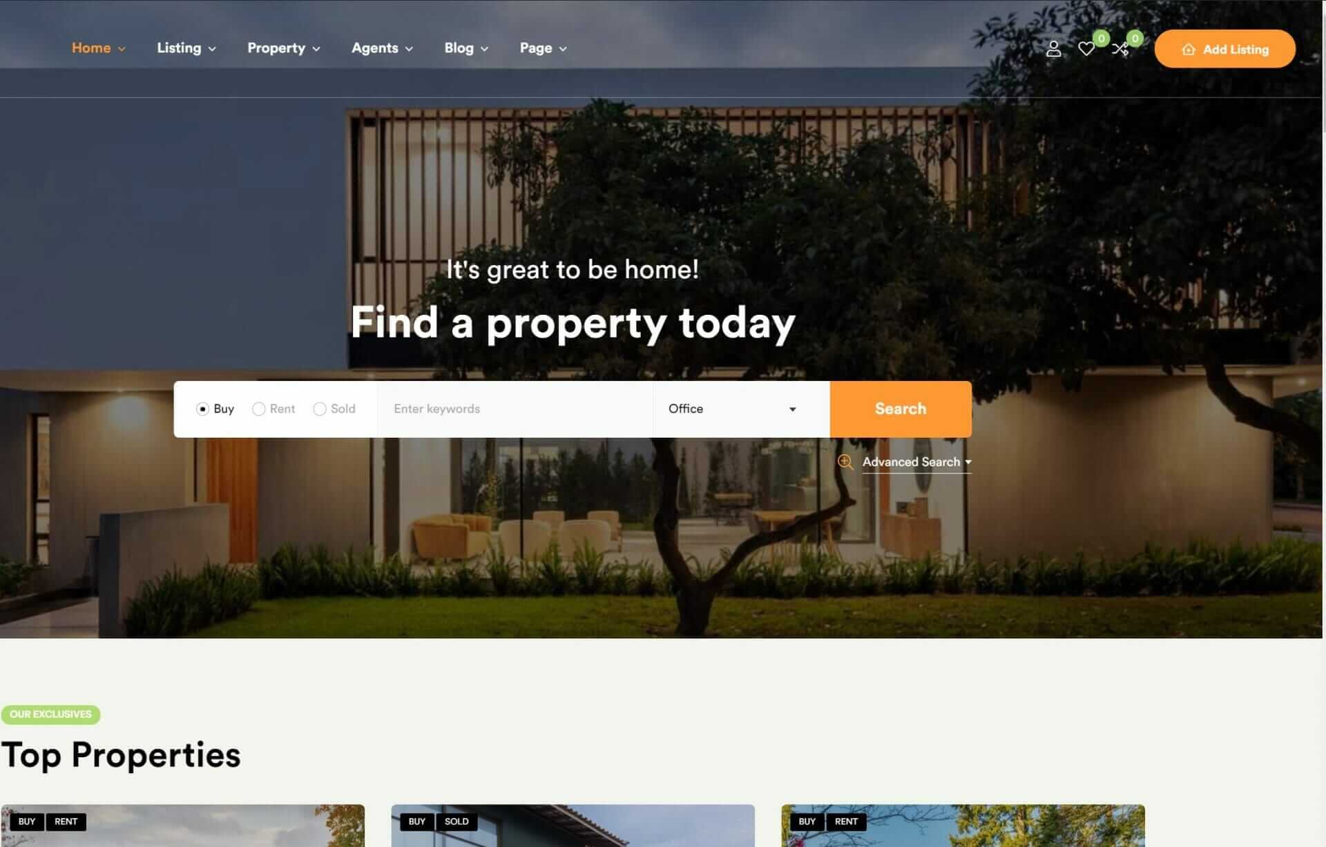
Orange for Creativity and Play

When designing a website that requires creative and playful vibes, incorporating the color orange can be a strategic decision to boost user engagement. By using orange, you’re injecting a vibrant choice into your web design elements, naturally evoking feelings of enthusiasm and energy in your users. This warm color creates a welcoming and inviting atmosphere, setting the tone for an engaging user experience.
As you thoughtfully incorporate orange into your design, you’re not only adding a pop of color but also drawing attention to important elements and calls to action. When used strategically, orange can spark creativity and playfulness, making your website a more enjoyable place to explore.
You’ll notice a boost in user engagement as the dynamic element of orange encourages interaction and participation. Whether it’s a call-to-action button or an accent color, orange can elevate your design and create a lasting impression on your users.
Purple for Luxury and Wisdom

As you explore the role of purple in web design, you’ll discover its potent association with luxury and wisdom, making it an ideal choice for high-end brands and websites focused on creativity and innovation.
You can leverage purple’s luxurious connotations to create a sophisticated user experience that resonates with a discerning audience, while also tapping into its symbolism of wisdom and spirituality to add depth and meaning.
Luxury Branding With Purple
What makes purple a particularly effective color for luxury branding in web design is its ability to evoke feelings of exclusivity, creativity, and elegance. When used in high-end brands, purple is a popular choice for luxury branding as it conveys opulence and sophistication to the target audience.
By incorporating purple hues in UX design, you can create a sense of opulence and extravagance, appealing to discerning audiences who crave premium quality.
Purple’s psychological impact on users aligns well with luxury brand messaging, conveying uniqueness and high-quality products. To establish a strong brand identity, utilize shades of purple strategically in web design. This won’t only convey sophistication but also create an immersive experience for users.
Wisdom in Color Psychology
By already establishing purple as a luxury branding powerhouse, you can also tap into its lesser-known, yet equally powerful, association with wisdom, allowing you to add depth and nuance to your web design. When used thoughtfully, purple can evoke feelings of sophistication and elegance, while also conveying a sense of calming peacefulness. This makes it an ideal color for websites that require a touch of creativity and innovation.
In color psychology, purple is often linked with luxury, royalty, and wisdom. Here’s a breakdown of what different shades of purple can convey in your web design:
| Shade of Purple | Emotional Connection |
|---|---|
| Light Purple | Calming and soothing, evoking feelings of peacefulness |
| Rich Plum | Sophisticated and luxurious, perfect for high-end branding |
| Deep Eggplant | Creative and innovative, adding a touch of wisdom to your design |
Red for Passion and Excitement

Your website’s call-to-action buttons can’t go unnoticed with the strategic use of red, a vibrant color that sparks passion, energy, and excitement. When used effectively, red creates a sense of urgency, drawing users’ attention to the most important elements on your webpage.
By leveraging the psychological impact of red, you can increase conversions, enhance user engagement, and create a memorable experience.
Here are just a few ways you can harness the power of red in your web design:
- Call-to-action buttons: Use red to make your CTAs stand out and encourage users to take action.
- Alerts and notifications: Red is the perfect color for alerting users to important information or errors.
- Highlighting importance: Use red to draw attention to key features, promotions, or limited-time offers.
- Creating a sense of urgency: Red can create a sense of FOMO (fear of missing out), encouraging users to act quickly.
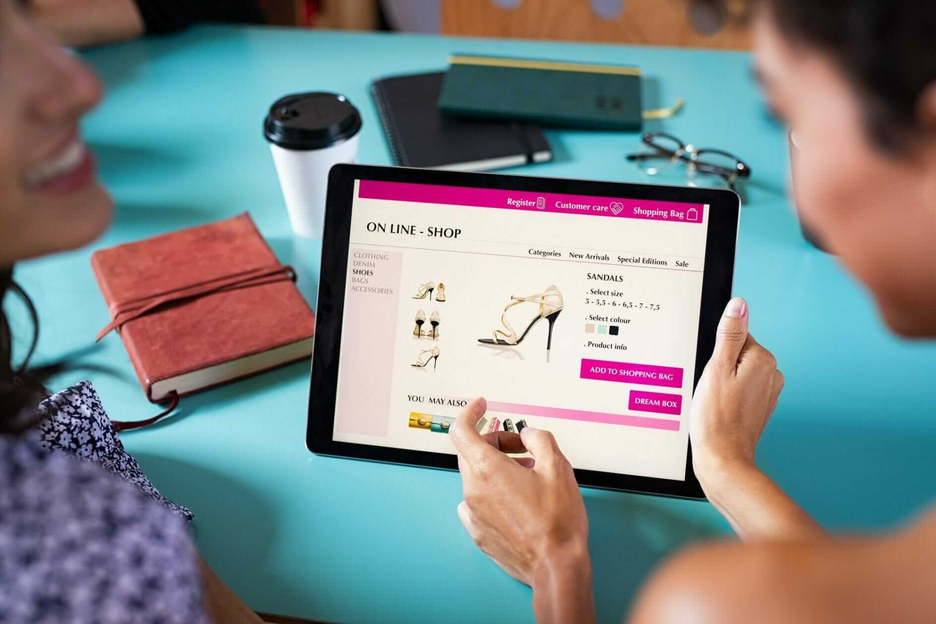
Pink for Femininity and Beauty

As you design for user experience, you’ll find that pink is a powerful color that can evoke feelings of warmth and femininity, making it a popular choice for brands targeting female audiences.
When used thoughtfully, pink can add a touch of elegance and sophistication to your web design, creating a soft and welcoming experience for your users.
Pink Color Psychology Explained
Incorporating pink into your web design taps into the color’s long-standing association with femininity, love, and beauty, making it particularly effective for brands targeting female audiences. By leveraging pink’s emotional connections, you can create a user experience that resonates with your target audience.
Here are four key aspects of pink color psychology to ponder:
- Evokes feelings of warmth and compassion: Pink has been proven to elicit feelings of tenderness, warmth, and compassion in users, enhancing the overall user experience.
- Conveys elegance and sophistication: Pink is often used in beauty and fashion industries to convey a sense of luxury, elegance, and refinement.
- Creates a visually appealing atmosphere: Incorporating pink in web design can create a visually appealing and inviting atmosphere, encouraging user engagement and interaction.
- Attracts attention and conveys style: Pink can be effectively used in CTAs, branding elements, and imagery to attract attention and convey a sense of style and glamour.
Designing for Female Audiences
When designing for female audiences, leveraging pink’s associations with femininity, love, and beauty can help create a user experience that resonates deeply with your target audience. By incorporating pink strategically, you can evoke feelings of warmth, compassion, and sensitivity – all of which are essential for building a strong emotional connection.
Brands in the fashion and beauty industries have long used pink to convey a sense of elegance, sophistication, and empowerment to female consumers.
As you design for women, consider how pink can create a visually appealing and engaging experience. A pink color scheme can add a touch of femininity and beauty to your product or service, making it more relatable and desirable. To create a cohesive look, balance pink with neutral shades that complement its warmth. By doing so, you’ll create an aesthetic that exudes elegance and sophistication.
Pink Shade Variations Matter
While leveraging pink’s associations with femininity and beauty can help create a compelling user experience for female audiences, the impact of this color depends largely on the specific shade you choose.
Pink shades can evoke a range of emotions, from innocence and sweetness to energy and excitement. When targeting female audiences in web design, you’ll want to contemplate the varying effects of different pink shades.
Here are four ways to utilize pink shade variations effectively:
- Soft pink tones: Create a calming and nurturing effect, ideal for websites focusing on wellness, beauty, or healthcare.
- Light pink: Represents innocence and sweetness, perfect for brands targeting young women or promoting playful, feminine products.
- Hot pink: Conveys energy and excitement, great for edgy, fashion-forward brands or entertainment-focused websites.
- Dusty pink: Adds a touch of sophistication and elegance, suitable for luxury brands or websites targeting mature women.
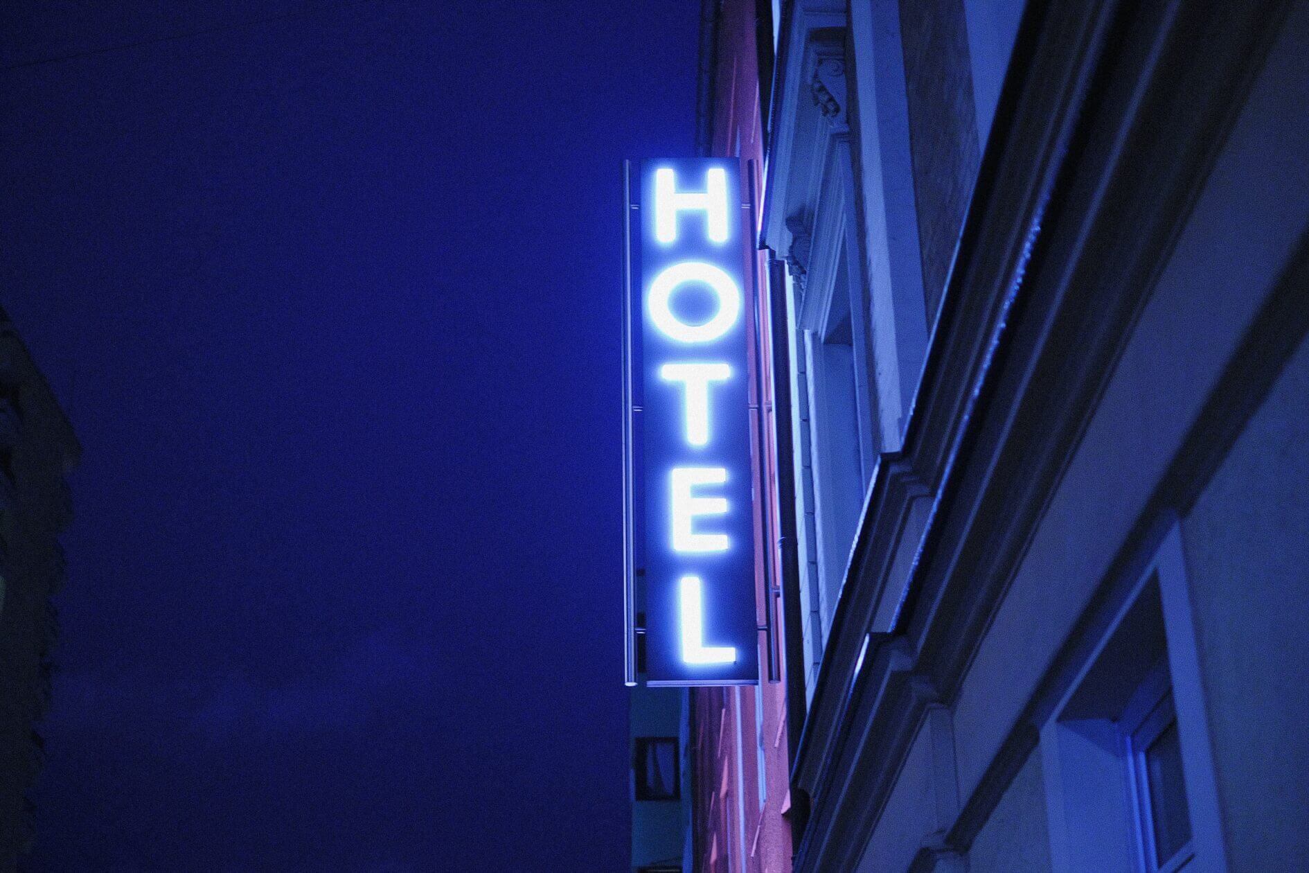
Turquoise for Futurism and Innovation

Turquoise is a color that instantly conveys a sense of futurism and innovation in your web design, making it a go-to choice for companies that want to appear cutting-edge and forward-thinking. When you incorporate turquoise into your web design, you’re signaling to your users that you’re a modern, dynamic brand that’s not afraid to push boundaries and explore new ideas.
This is why AI companies often turn to turquoise to represent their authority in modern technology. By leveraging turquoise, you can create a sophisticated and cutting-edge brand identity that resonates with your audience.
When users interact with your turquoise-infused web design, they’ll feel a sense of trust and forward-thinking. Turquoise has a unique ability to evoke feelings of creativity and progress, making it perfect for digital products that want to inspire and motivate their users.
Black for Elegance and Sophistication

By incorporating black into your web design, you can instantly convey a sense of elegance and sophistication that elevates your brand’s authority and luxury appeal. Black creates a sense of timelessness and professionalism, making it perfect for high-end brands and corporate websites.
Here are a few ways you can use black to enhance your website’s UX:
- Create contrast: Black backgrounds can make other colors pop, creating a visually striking contrast that attracts users.
- Enhance readability: Using black text on a white background makes sure that your content is easy to read and understand.
- Add a touch of luxury: Black elements can introduce a sense of luxury and sophistication to your website, making it feel high-end and premium.
- Go for a modern aesthetic: Incorporating black elements can introduce a sleek and modern touch to your website, making it feel fresh and contemporary.
White for Simplicity and Clarity

Incorporating white into your web design lets you create a clean and minimalist aesthetic that immediately conveys simplicity and clarity to your users. A white background gives your website a sense of spaciousness, focusing attention on the content that matters most. You’re also enhancing readability, as text and other elements stand out more sharply against a clean white canvas.
But white does more than just provide a clean backdrop – it also plays an essential role in organizing information and guiding the user’s eye through your site. By incorporating negative space (the empty space around and between elements), you can create a clear visual hierarchy that helps users quickly grasp your site’s structure and content.
This thoughtful use of white space doesn’t just make your site look more elegant – it actually boosts user engagement, as visitors can more easily find what they’re looking for. So, don’t underestimate the power of white in your web design. By embracing this versatile color, you can craft a website that’s as functional as it’s visually appealing.
To Recap
You’ve explored the top 10 colors that enhance UX in web design. Now, it’s clear that the 60-30-10 rule theory holds truth – 60% of a dominant color, 30% of a secondary color, and 10% of an accent color creates a visually appealing design.
By applying this rule with the right colors, you can evoke emotions, convey messages, and improve user engagement. Effective color schemes can make or break your website’s UX, so choose wisely.