
Boosting your website’s usability can greatly impact your online success. To start, optimize your website’s loading speed, as a 3-second delay can drive away nearly half of your potential customers. Maintain a consistent site design to improve user familiarity and brand recognition. Ensure mobile-friendly design, as over 50% of web traffic comes from mobile devices. Use familiar navigation layouts, optimize content with headings, and balance images and content to keep users engaged. By implementing these strategies, you’ll be well on your way to creating a user-friendly website. Discover the full range of techniques to maximize your site’s potential.
Reduce Website Page Loading Times
To enhance your website’s usability, reducing page loading times is vital, as it directly impacts visitor engagement and conversion rates. You want your website to load quickly, and so do your visitors – 40% of shoppers will leave a website that takes more than three seconds to load. This is why achieving fast loading times is essential.
Optimizing images is a great place to start. By reducing file size and scaling them correctly, you can greatly improve page loading speed. Also, don’t forget to optimize your CSS files and enable browser caching to further reduce website loading times. These small tweaks can make a significant difference, as slow-loading pages can deter users from visiting your website altogether.
You’ve got less than two seconds to impress before visitor abandonment starts to set in, making every millisecond count when it comes to page load. So, take the time to focus on improving loading time – your users will thank you for it, and so will your conversion rates. By prioritizing faster loading speeds, you’re one step closer to creating a seamless user experience that will keep visitors coming back for more.
Maintain Consistent Site Design

Maintaining a consistent site design is essential for creating a cohesive user experience, as it enhances user familiarity and brand recognition across every page of your website. By keeping a constant theme, you reassure your users and make them more comfortable exploring your site.
Mediahawk’s website is a great example of the benefits of maintaining a consistent layout. Take a look at how they’ve used a consistent design to instill confidence in their users and promote cohesive branding.
Here are a few key benefits of a consistent site design:
- Improved user familiarity: When your site’s layout is consistent, users can quickly find what they’re looking for, which makes them more likely to engage with your content.
- Enhanced brand recognition: A consistent design reinforces your brand identity, helping users remember your brand and associate it with your values.
- Increased confidence: When users feel comfortable browsing your site, they’re more likely to trust your brand and become loyal customers.
- Better engagement: Familiarity with your site’s layout encourages users to explore and engage with your content, which can lead to increased conversions and sales.
Ensure Mobile Responsive Design

Building on the significance of a consistent site design, you should also prioritize a mobile-friendly design to cater to the growing number of users accessing your website through mobile devices. With over 50% of web traffic coming from mobile devices, it’s vital that your site adapts seamlessly to different screen sizes.
By implementing a mobile-friendly design, you’ll not only improve website usability but also enhance the overall user experience. A responsive design guarantees that your site’s layout, images, and content adjust automatically to fit various mobile devices, eliminating the need for manual resizing or scrolling. This flexibility is essential to keeping users engaged, as mobile users are 5 times more likely to abandon a task if a site isn’t mobile-friendly.
Additionally, Google prioritizes mobile-friendly websites in search results, making a responsive design essential for visibility and traffic. By adopting a mobile-friendly design, you can increase mobile conversions by up to 60%, which is a significant boost to your site’s success. Invest in a responsive design today and discover the benefits of improved usability and user satisfaction for yourself.
Use Familiar Navigation Layouts

By leveraging a standard navigation layout, you can tap into users’ existing expectations and make it easier for them to find the information they need on your site. This is especially important if you want to improve the usability of your website. Simple navigation is key to a positive user experience. To achieve this, stick to familiar navigation layouts that users are already comfortable with.
Here are four reasons why familiar navigation layouts are essential:
- Easy to use: A standard navigation bar at the top of the site makes it easy for users to find what they’re looking for.
- Reduces confusion: Unusual navigation layouts can confuse users and hinder usability.
- Enhances user familiarity: Consistent navigation across web pages makes users feel more comfortable and in control.
- Boosts usability: Sticking to a familiar navigation layout guarantees better usability and user experience.
Optimize Content With Headings

As you optimize your website’s content, you’ll want to pay attention to how you’re using headings to organize and structure your information.
By creating a clear hierarchy with headings, you’ll make it easier for users to scan and understand your content, which in turn can boost engagement and user experience.
When done correctly, headings also provide a significant SEO benefit, helping search engines understand the context and relevance of your content.
Organize Content With Hierarchy
When designing your website, organizing content with a clear hierarchy is essential to help users quickly find what they’re looking for. A well-structured content hierarchy boosts website usability and enhances the overall user experience. By using headings and subheadings effectively, you’ll make it easier for users to navigate and understand your content. This, in turn, instills confidence in your users and increases engagement.
Here are four ways to optimize your content hierarchy:
- Break up long content: Divide lengthy articles or pages into smaller, manageable sections with clear headings and concise subheadings.
- Create a clear structure: Organize your content in a logical order, using headings to highlight key points and subheadings to provide additional context.
- Use headings for SEO: Search engines use headings to understand the structure and content of your page, so use them to improve your SEO rankings.
- Enhance user experience: By making your content easy to scan and understand, you’ll improve the overall user experience and encourage users to stay on your site longer.
Enhance Readability With Structure
Building on the foundation of a clear content hierarchy, you can further improve your website’s usability by optimizing your content with headings that enhance readability and structure.
By incorporating headings and subheadings, you’ll not only boost user engagement but also improve your SEO performance. Structured content with clear headings has a significant impact on user confidence, making it easier for them to navigate and digest information. This, in turn, enhances readability, allowing users to quickly grasp the essence of your content.
Effective headings and subheadings break up content, making it more scannable and reducing cognitive load. This contributes to the ‘long click’ metric, where users engage with your content for longer periods. By using headings effectively, you can improve both user experience and search engine visibility.
As you create content, remember that headings are essential for structuring information. By optimizing your content with headings, you’re taking a pivotal step towards improving user engagement, readability, and overall website usability. This thoughtful approach will resonate with your audience, setting your website apart from the competition.
Use Headings for Clarity
By strategically incorporating headings into your content, you can greatly enhance its clarity and make it easier for users to navigate. Headings are an essential element in creating a well-organized content hierarchy, which improves user engagement and retention rates. They also provide a clear visual hierarchy, guiding users to key sections and enhancing the overall user experience.
Here are four ways headings can boost your website’s usability:
- Break up content: Headings make it easier for users to scan and understand information quickly, reducing cognitive overload and improving comprehension.
- Improve SEO: Headings help search engines understand the structure and relevance of your content, increasing your website’s discoverability and ranking.
- Enhance user engagement: Content with headings tends to have higher user engagement and retention rates, as users can quickly find the information they need.
- Create a clear visual hierarchy: Headings provide a clear visual structure, guiding users to key sections and enhancing the overall user experience.
Highlight Key Features Clearly

As you design your website, you’ll want to highlight key features clearly to capture your users’ attention and help them quickly find the information they need.
By creating a clear visual hierarchy, you’ll be able to draw users’ eyes to the most important features and benefits of your product or service.
In this section, we’ll explore how to effectively use visual elements, clear product information, and strategic call-to-action placement to make your key features stand out.
Key Feature Visual Hierarchy
Creating a clear visual hierarchy for key features on your website helps you direct users’ attention to the most important information, making sure they can quickly find what they need. This strategic approach enhances user information access, making it simpler for visitors to navigate your site and discover its value. By utilizing icons and a well-planned visual hierarchy, you can make key features stand out and elevate the overall user experience.
Here are four ways a clear visual hierarchy boosts website usability:
- Prioritized content: By making key features prominent, you guarantee that users see the most important information first.
- Streamlined navigation: A well-organized visual hierarchy simplifies site navigation, reducing bounce rates and promoting engagement.
- Enhanced discoverability: Visual hierarchy helps users quickly locate what they need, improving user satisfaction and experience.
- Improved accessibility: By presenting key features clearly, you enable users with disabilities to navigate your site more easily.
Clear Product Information
Your website’s product pages play a crucial role in driving conversions, and highlighting key features clearly is essential in assisting users to make informed decisions. By providing a clear presentation of product information, benefits, or services, you can enhance user experience and increase engagement.
Think of it like this: when users land on your product page, they’re looking for answers to specific questions. What does this product do? What’re its key features? How will it benefit me? By highlighting these key features clearly, you’re making it easy for users to find the information they need.
Using icons to emphasize key features can also make them stand out and enhance visual appeal. Well-structured content with highlighted key features can help users navigate your website more effectively.
By providing concise and easily accessible information about your products or services, you can lead to higher user satisfaction and conversions. It’s all about making it easy for users to find what they’re looking for, and clear product information is crucial to achieving that.
Effective Call-to-Action Placement
By highlighting key features clearly, you’ve taken the first step in driving conversions; now, it’s time to contemplate the strategic placement of calls-to-action (CTAs) to encourage users to take the next step.
Effective call-to-action placement is vital for boosting website usability and user engagement. To maximize your CTAs’ impact, consider the following strategies:
- Above the Fold: Place your most important CTAs above the fold, where users can see them without scrolling.
- Visual Hierarchy: Use icons, colors, and typography to create a clear visual hierarchy, drawing users’ attention to your CTAs.
- Proximity to Key Features: Position CTAs near key features, making it easy for users to take action once they’ve found what they’re looking for.
- Whitespace: Balance your CTAs with sufficient whitespace, avoiding clutter and ensuring users can focus on the action you want them to take.
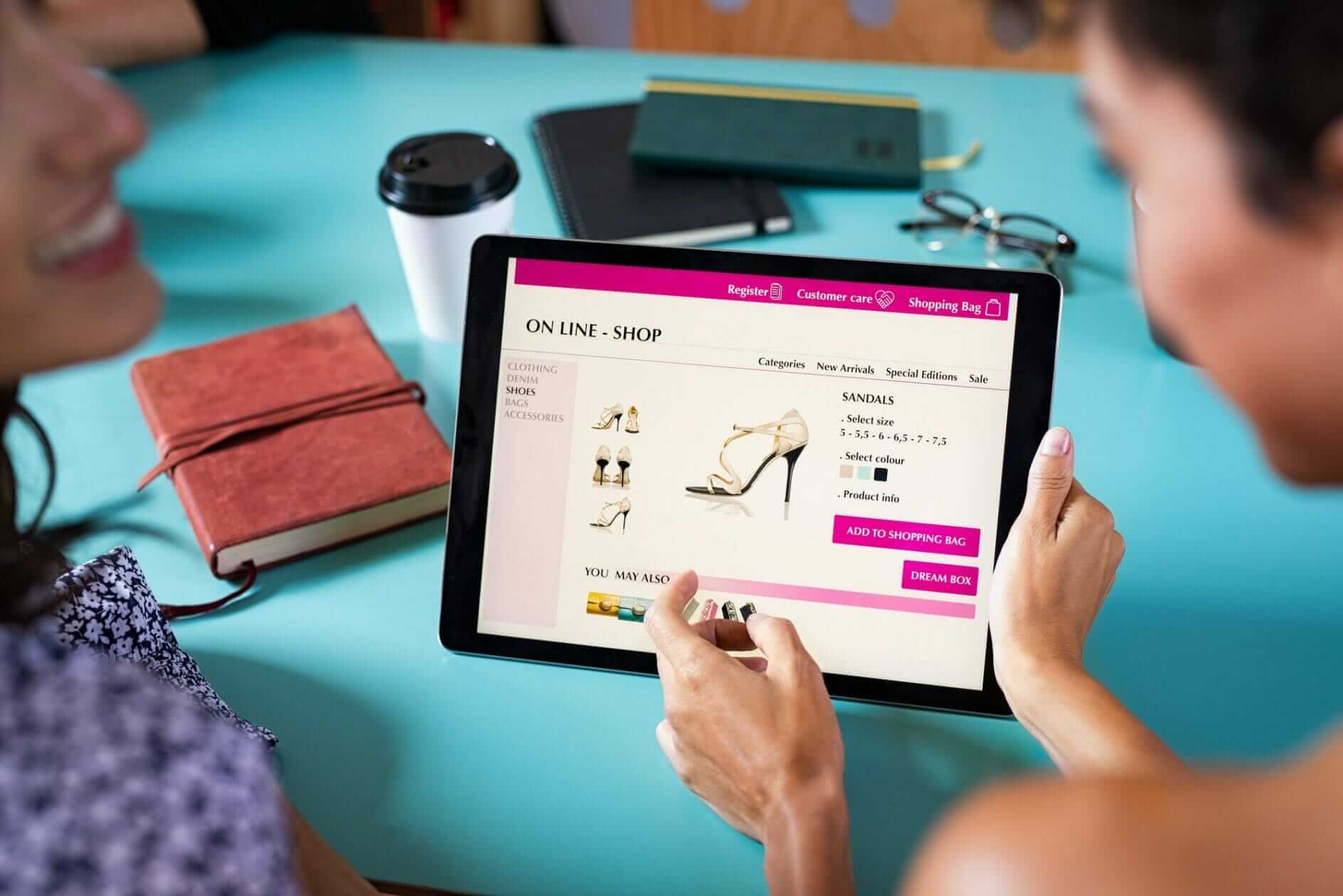
Balance Images and Content

Striking the perfect balance between images and content on your website is key to keeping users engaged and interested. Too much text can overwhelm, while too many images can distract. You want to find that sweet spot where your content is enhanced by relevant, high-quality images that break up the text and maintain user interest.
| Image Type | Content Balance | User Engagement |
|---|---|---|
| High-quality product images | Detailed product descriptions | Increased conversions |
| Relevant background images | Concise and focused content | Improved readability |
| Infographics | Data-driven content | Enhanced understanding |
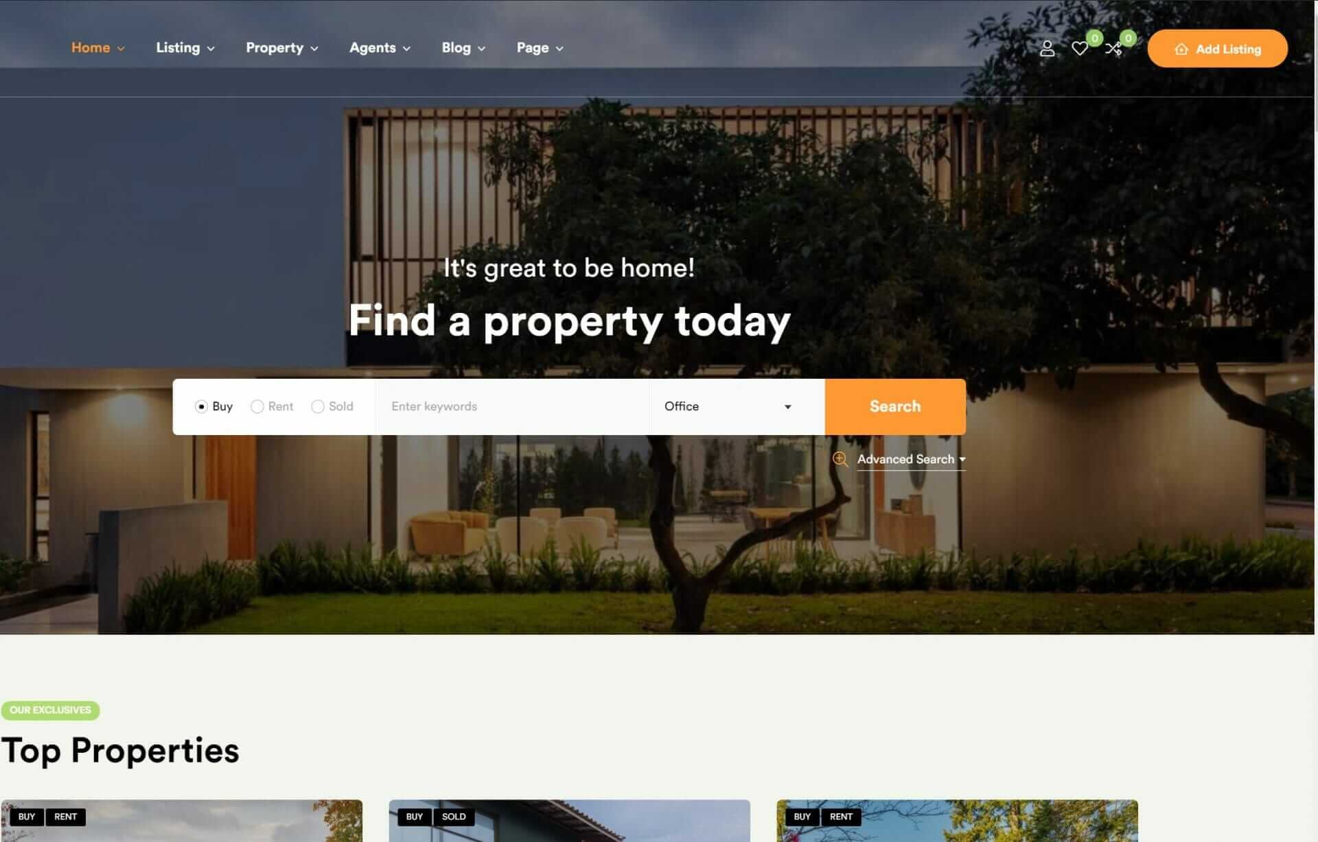
Streamline Website Navigation

Streamlining your website’s navigation is essential for making a good impression and making sure users can easily find what they’re looking for. By simplifying your website navigation, you’re one step closer to providing an innovative user experience. A standard layout at the top of your site is the way to go, as most users prefer this familiar design.
Here are some tips to help you streamline your website’s navigation:
- Stick to the top: Place your navigation bar at the top of your site, where users expect to see it.
- Be consistent: Use consistent navigation styles throughout your site to prevent user confusion and guarantee a smooth browsing experience.
- Use a recognizable navigation bar: Avoid reinventing the wheel and stick to a familiar navigation layout that users are comfortable with.
- Don’t get too creative: Familiar navigation layouts ensure better usability, so avoid trying to be too innovative with your navigation design.
Enhance Mobile User Experience

As you focus on enhancing your mobile user experience, you’ll want to prioritize two key areas: optimizing mobile page speed and simplifying mobile navigation.
With the majority of website traffic coming from mobile devices, you can’t afford to have a slow-loading site – 53% of users will abandon it if it takes longer than 3 seconds to load.
Optimize Mobile Page Speed
To improve mobile user experience, you need to optimize your website’s mobile page speed, as a delay of just a few seconds can result in a significant increase in bounce rates. With mobile users expecting websites to load in under 3 seconds, it’s vital to prioritize speed optimization.
Here are some key strategies to help you achieve an optimized mobile page speed:
- Implement responsive design: Ensure a smooth user experience across various mobile devices by using responsive design.
- Test mobile performance: Utilize tools like Test My Site to identify and address speed optimization issues.
- Prioritize mobile responsiveness: With over half of web users accessing sites on mobile devices, it’s important to prioritize mobile responsiveness.
- Optimize images and content: Compress images and optimize content to reduce page load times and enhance overall mobile page speed.
Simplify Mobile Navigation
How can you simplify mobile navigation to meet the expectations of your mobile users, who are increasingly demanding smooth and intuitive experiences on-the-go?
With over 50% of web traffic coming from mobile devices, it’s essential to prioritize mobile navigation to enhance usability and boost conversions.
You can start by implementing a responsive design that ensures optimal user experience across all devices, including smartphones and tablets. This way, your mobile users can easily access key information and navigate through your website without any glitches.
Smooth navigation is key to reducing bounce rates and increasing user engagement. By simplifying your mobile navigation, you’re making it easier for users to find what they’re looking for, which ultimately leads to higher conversions.
Improve Website Loading Speeds

Improving your website’s loading speeds is essential, since even a brief delay can lead to abandonment. You’ve invested time and money into creating a high-quality web design, and now it’s time to make sure that it loads quickly to enhance your website’s usability. A staggering 40% of shoppers will leave a website if it takes more than three seconds to load, so every second counts.
To boost your loading speeds, consider these strategies:
- Optimize your images: Reduce file sizes and scale images correctly to prevent slow loading times.
- Streamline your CSS files: Remove unnecessary code and minify files to reduce loading times.
- Implement browser caching: Allow browsers to store frequently-used resources, reducing the need for repeat requests.
- Prioritize content: Load critical content first, making certain that users see the most important information quickly, even if the rest of the page takes a little longer to load.
To Recap
You’ve implemented these 10 tips to boost website usability, but here’s the clincher: a one-second delay in page loading time can result in a 7% reduction in conversions. With the average website taking around 3-5 seconds to load, that’s a significant loss.
By prioritizing usability and speed, you’ll not only improve user experience but also increase conversions and ultimately drive business growth. So, keep your website streamlined, intuitive, and lightning-fast – your users (and your bottom line) will thank you.