You’re designing a website and want to make it visually stunning, but where do you start? Understanding the 7 key principles of color harmony is essential for creating an engaging online experience. You need to grasp the Color Wheel, balance warm and cool colors to evoke emotions, and create harmonious color schemes that captivate users. Effective contrast, analogous and complementary colors, and the strategic use of neutral colors are also vital. Finally, achieving visual balance by organizing colors hierarchically and distributing them evenly will elevate your design. By mastering these principles, you’ll reveal the secrets to crafting a website that truly stands out.
Understanding the Color Wheel
To create harmonious color schemes, you need to start by understanding how the color wheel functions, a fundamental tool that helps designers visualize color relationships. By grasping the color wheel, you’ll immerse yourself in the key to crafting balanced and visually appealing designs in web development.
Let’s break it down: primary colors – red, yellow, and blue – form the base of the wheel, while secondary colors – violet, orange, and green – are created by mixing the primaries. Tertiary colors expand your palette by combining primary and secondary colors.
As you explore the color wheel, you’ll uncover how to select complementary or analogous color schemes that elevate your web design. Complementary color schemes offer striking contrast, while analogous colors create a smooth, cohesive look.
By leveraging these harmonious color combinations, you’ll captivate your audience and convey your message effectively. Whether you’re a seasoned designer or just starting out, mastering the color wheel will revolutionize your approach to color in web design. With this foundational knowledge, you’ll be able to create stunning, effective designs that engage and inspire your users.
Balancing Warm and Cool Colors
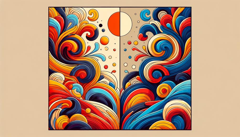
Balancing warm and cool colors is essential in web design, as it allows you to create a visual hierarchy, evoke emotions, and guide the user’s attention. By mixing warm colors like red, orange, and yellow, which evoke energy and passion, with cool colors like blue, green, and purple, which create a calming and soothing effect, you can establish the desired mood or atmosphere on your website.
When balancing warm and cool colors, consider the following key principles:
- Contrast warm and cool colors: Use warm colors for calls-to-action and cool colors for backgrounds to create visual interest and contrast.
- Understand the psychological impact: Recognize how warm colors can stimulate energy and passion, while cool colors can promote relaxation and calmness.
- Experiment with ratios: Find the right balance between warm and cool colors to achieve the desired mood and atmosphere on your website.
Creating Harmonious Color Schemes
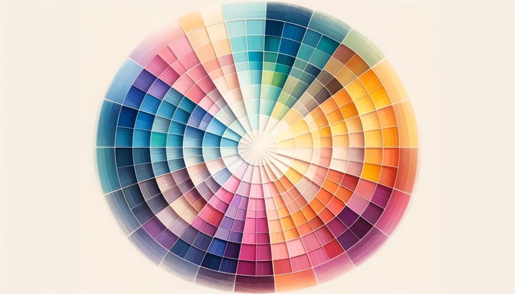
Now that you’ve got a solid grasp of balancing warm and cool colors, it’s time to create harmonious color schemes that elevate your web design.
You’ll want to explore the fundamentals of color harmony, including complementary, analogous, triadic, and monochromatic color combinations, in order to craft a visually appealing palette.
Color Harmony Fundamentals
When creating harmonious color schemes, you’ll want to start by understanding the three primary principles of color theory that underpin all successful color combinations. By grasping these fundamentals, you’ll be able to craft visually appealing and balanced color schemes that elevate your brand identity and user experience.
Here are three key principles to get you started:
1. Understand the Color Wheel:
The color wheel is a circular representation of colors, with primary colors (red, yellow, and blue) at the center. By selecting colors that are opposite each other (complementary colors), next to each other (analogous colors), or equally spaced from each other (triadic color scheme), you can create harmonious color combinations.
2. Choose a Color Scheme:
Select a monochromatic color scheme for a cohesive look, or experiment with complementary, analogous, or triadic schemes to add contrast and visual interest.
3. Consider Color Theory:
Remember that color theory is all about creating balance and harmony. By choosing colors that work well together, you can create a color scheme that enhances your brand identity and user experience.
Balancing Color Combinations
To create a harmonious color scheme, you’ll need to strike a balance between colors that work well together, which is necessary for crafting visually appealing designs that enhance user experience.
By employing color harmony techniques, you can create harmonious color schemes that captivate your audience. The color wheel is a valuable tool for selecting colors that work well together based on their relationships and contrasts.
Start by creating a primary color palette as a base, which will help establish a cohesive and harmonious color scheme.
When balancing color combinations, consider using complementary schemes, which pair colors that are opposite each other on the color wheel. This technique creates visually pleasing combinations that add depth and interest to your design.
Testing different color combinations is also essential to make sure balance and harmony in your web design. By experimenting with various color relationships, you’ll be able to identify the perfect balance of colors that enhance your design.
Effective Use of Contrast
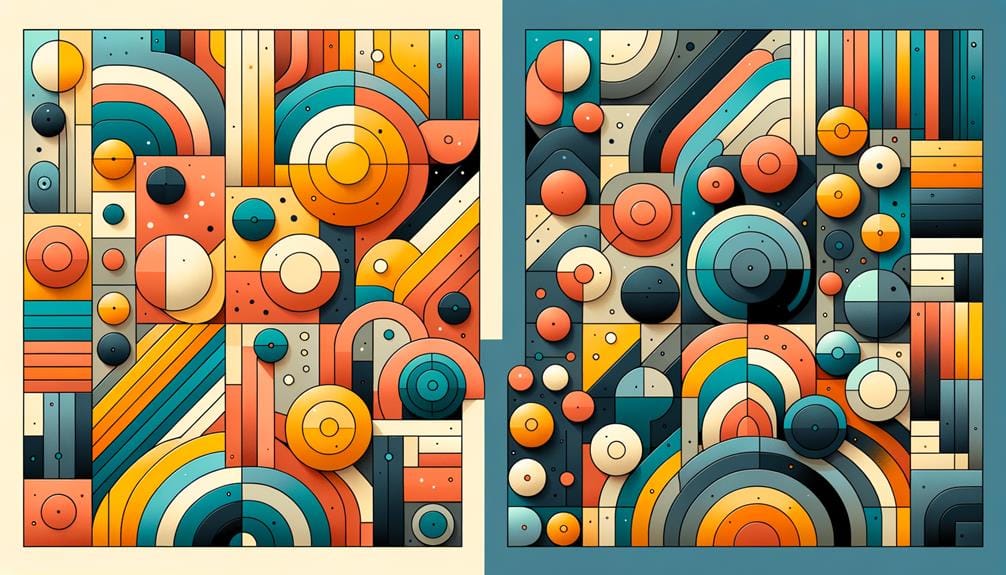
As you design your website, you’re probably thinking about how to make your content stand out – that’s where contrast comes in. By using contrasting colors effectively, you’ll create a visual hierarchy that guides your users’ attention to the most important elements on the page.
Now, let’s explore how you can balance color contrast to achieve a harmonious and accessible design that benefits all users.
Visual Hierarchy Principles
Contrast plays a pivotal role in establishing an effective visual hierarchy on your website, allowing you to direct users’ attention and create a clear focal point. By leveraging contrast, you can emphasize elements, improve readability, and enhance user engagement.
In web design, contrast refers to the visual difference between elements, and using it strategically can guide users’ attention to important elements on a webpage.
To create an effective visual hierarchy, consider the following principles:
- High contrast between text and background: Guarantee that your text stands out from the background to improve readability and user engagement.
- Contrasting colors for emphasis: Use contrasting colors to draw attention to important elements, such as calls-to-action or key messages.
- Proper contrast ratios for accessibility: Ensure that your contrast ratios meet accessibility standards to cater to users with visual impairments.
Balancing Color Contrast
By balancing color distinction effectively, you create a clear visual hierarchy that directs users’ attention to key elements and enhances the overall readability of your website.
This strategic use of distinction doesn’t just make your site look more visually appealing; it also improves accessibility for color-impaired users. When you achieve high distinction between text and background colors, you’re ensuring that your site’s content is clear and easy to read for everyone.
To create a dynamic visual experience, you need to balance color distinction in a way that draws users’ attention to key elements. This might involve using bold, contrasting colors for calls-to-action or subtle, muted tones for background elements.
By testing your color combinations on various devices, you can ascertain that your site’s usability and readability remain consistent across different screens. By leveraging distinction effectively, you can create a site that’s not just aesthetically pleasing, but also intuitive and user-friendly.
Analogous and Complementary Colors
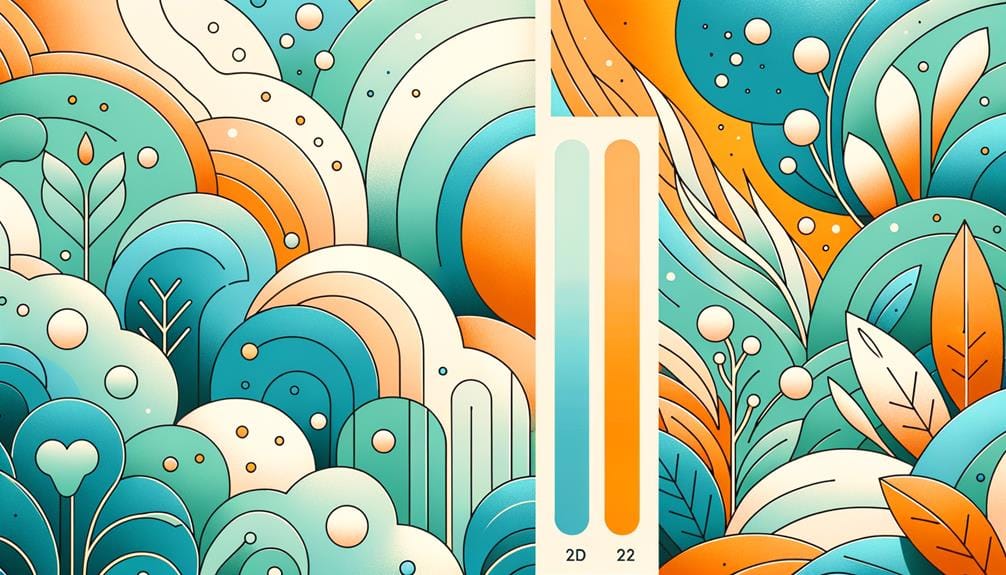
When designing a website, you can create a visually appealing color scheme by using analogous colors, which are colors next to each other on the color wheel, to produce a harmonious and subtle effect. Analogous color schemes are soothing and easy on the eyes, perfect for creating a serene and cohesive website design.
On the other hand, if you want to add some excitement to your web design, you can use complementary colors, which are opposite each other on the color wheel. This will give you high contrast and visual interest, making key elements stand out and grab attention.
Here are three ways you can balance analogous and complementary colors to create a dynamic visual experience:
- Create a bold accent wall: Use a complementary color to create a bold accent wall that draws attention to a specific section of your website.
- Use analogous colors in the background: Use analogous colors in the background to create a soothing atmosphere, and then add complementary colors to make key elements stand out.
- Experiment with different shades: Experiment with different shades of analogous and complementary colors to create a unique and engaging visual experience that captures users’ attention effectively.
Role of Neutral Colors

Neutral colors play an important role in web design, forming the foundation of your color palette and helping to balance bold or bright colors. By incorporating neutral colors like white, gray, and beige, you create a sense of sophistication, elegance, and simplicity in your website layout.
These colors serve as a calming backdrop for your content, making it easier to read and navigate. But that’s not all – neutral colors also help harmonize contrasting colors in your design, preventing visual overload and enhancing user focus on key elements.
When used effectively, neutral colors can elevate your design without overpowering it. They provide a clean canvas for your content, allowing your bold and bright colors to shine. By striking the right balance between neutral and bold colors, you can create a visually appealing design that engages your users without overwhelming them.
Achieving Visual Balance
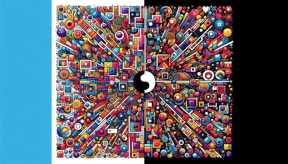
To create a harmonious composition, you need to distribute color elements evenly throughout your design, striking a balance that guides the user’s attention and enhances their overall experience. Achieving visual balance is essential in web design as it helps establish a sense of order and coherence.
By applying principles of color harmony, you can create a visually appealing design that engages users and communicates your message effectively.
Here are three ways to achieve visual balance in your web design:
- Symmetry: Use identical elements on either side of a central axis to create a sense of balance and stability.
- Asymmetry: Balance elements of different sizes and colors to create a dynamic and interesting composition.
- Color hierarchy: Organize colors in a hierarchical structure to guide the user’s attention and create visual flow.
To Recap
As you weave together the threads of color harmony in web design, a vibrant tapestry emerges. Balance warm and cool hues, contrast and analogous colors, and don’t forget the neutral tones that tie everything together.
By embracing these 7 key principles, you’ll create a visual symphony that resonates with your audience. Your design will pulse with energy, drawing users in and guiding them through a seamless experience.
Color harmony is the unsung hero of web design – now go make it sing!


